In this article, we provide our top 12 steps to creating a Shopify-level WooCommerce experience.
Introduction
The e-commerce marketing funnel is the path that potential customers take from “awareness” of your store to becoming “paying” customers.
For your store to be successful a.k.a profitable, you need to have a clear and concise funnel that will guide users towards conversion.
You’ll need to create a marketing funnel that starts with awareness and leads to consideration, purchase, and loyalty.
To create a high-converting e-commerce marketing funnel for your store, you’ll need to focus on the following aspects:
- Awareness: This is the top of your funnel, where potential customers are first introduced to your online store. You’ll need to make sure that your business is visible to your target audience and that you’re using the right marketing channels to reach them.
- Consideration: Once interested people are aware of your store, they’ll need to consider whether or not your products are right for them. This is where you’ll provide more information about what you’re selling and why your products are the best solution to the customer’s problem.
- Purchase: As soon as a potential customer is considering your product, they’ll need to make a purchase. This means you’ll have to have a strong call-to-action and an easy-to-use checkout process.
Now, here’s the thing:
No matter what your online store is selling, you will always have to deal with the occasional customer who does not convert.
It’s just a natural part of doing business. But that doesn’t mean you have to just accept it and move on.
Instead, you need to take a look at your store and see if any obstacles might be causing customers to lose interest.
Once you’ve identified those obstacles, you’ll have to work on removing them so you can start converting more of those lost sales into actual paying customers.

What Can You Tweak to Take Your Conversions to the Next Level?
Let’s face it, there’s always room for improvement when it comes to your store’s sales funnel.
For example, you can level up your conversion rate by simply improving your landing pages. Or making your product pages more user-friendly.
The bottom line is that by making even small changes to your sales funnel, you can see big improvements in your conversion rate.
However, if you want to make the biggest difference to your store’s conversion rate, you need to focus on your checkout experience.
Without a doubt, one of the most frustrating experiences is working hard to get a shopper’s attention, create offers that interest them, and lose them at the point of purchase.
Check out these eye-opening cart abandonment statistics to get a better picture:
- The average cart abandonment rate across all industries is 69.57 percent
- E-commerce brands lose $18 billion in sales revenue each year because of cart abandonment
- Checkout optimization can boost conversion rates by 35.62 percent
Most WooCommerce stores ignore their checkout experience, and as a result, they’re leaving money on the table.
Why Is The Checkout Experience Usually Bad?
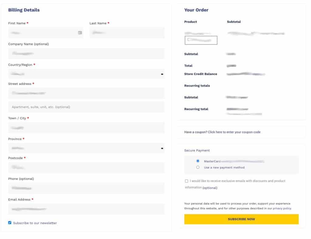
When compared to other aspects of a website, the checkout experience is one of the most important and complex workflows on your website.
Think about it, this is the portion of your website where people are handing over their hard-earned money to you in exchange for your products.
The fact is, most e-commerce sites aren’t designed by designers but by developers who are focused on making it function rather than look good and convert.
And while functionality is important, if your checkout experience isn’t visually appealing or easy to use, you’re going to lose a lot of sales.
The other problem with many e-commerce checkouts is that they are often overloaded with too many options and too much information.
This can lead to what’s known as decision paralysis, where the customer is so overwhelmed that they can’t make a decision and just abandon their cart.
Major e-commerce platforms like Shopify take a design-first approach to their checkout experience, resulting in a much better user experience and a higher conversion rate.
Even though their stores are not very customizable, they make it easy for anyone to create a beautiful and user-friendly e-commerce store focused on an efficient checkout experience.

How to Fix Your WooCommerce Checkout Experience in 12 Steps
If you’re using WooCommerce to power your online store, you might be thinking that there’s no way to create a checkout experience that looks as good as Shopify’s.
But that’s not true.
With the right approach, you can create a checkout experience for your WooCommerce store that’s just as beautiful and even more user-friendly than Shopify’s.
And while there’s no one-size-fits-all solution, here are ten steps you can take to improve your WooCommerce checkout experience and increase your conversion rate:
1. Use a Custom Checkout Plugin
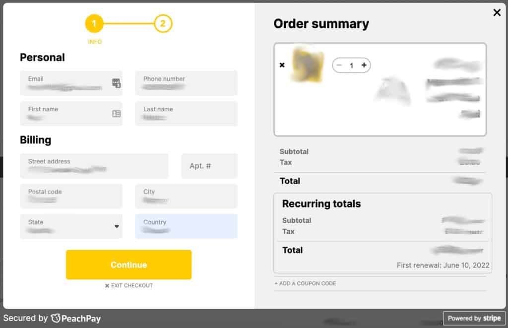
There are a few different plugins you can choose from, but our top pick is PeachPay.
PeachPay is one of the newer plugins in this category, but it’s quickly become one of our favorites due to its simple design, uniqueness, and ease of use.
The first thing to note about PeachPay is that it doesn’t cost anything. How does that work?
Their pricing is built right into the payment processor, such as Stripe’s or PayPal’s standard transaction fee.
This allows you to test out the plugin for free and then decide if it’s a good fit for your store.
Another great thing about PeachPay is that it’s very versatile. It works with multiple payment methods, currencies, and languages and also offers a wide range of customization options, including field editing functionality.
PeachPay replaces the outdated checkout page with a fully customizable checkout window. Visitors can jump to check out straight from the cart or the product page to reduce friction and improve conversions.
A key feature is that PeachPay offers returning users one-click checkout, across all stores using PeachPay. This is a game-changer.
Furthermore, you can use PeachPay with WooCommerce Subscriptions to offer customers even more flexibility. In fact, PeachPay is compatible with most plugins, themes, and site builders out-of-the-box.
But in case you need it, the customer service team is also very responsive and helpful, which is always a huge bonus.
Overall, PeachPay is a great option for anyone looking for a comprehensive checkout and payment solution for their WooCommerce store.
If you are not using PeachPay, give it a try, otherwise, you can also implement our other checkout experience improvements and recommendations below.


2. Keep It Simple
When it comes to your checkout experience, less is more. One of the biggest mistakes you can make with your checkout page is to try to cram too much information into one page.
You want to make it as easy as possible for people to buy from you, and that means keeping your checkout page clean and clutter-free.
Remove any unnecessary elements, like social media buttons, and focus on the essentials such as the customer’s name, shipping address, and payment information.
Compared to how Shopify’s checkout page looks, yours might seem a bit empty. Do not worry about that. The key is to make it easy for people to find what they are looking for and to fill out the form.
3. Add High-Quality Images
People are visual creatures, and that means they’re more likely to buy from you if your checkout experience includes high-quality images.
Make sure to use professional photos of your products and avoid using generic stock images. The idea is to give people a realistic idea of what they’re buying. Use your product pictures on the shop, cart, and checkout pages to keep things consistent and increase customer confidence.
Every Shopify store uses high-quality product photos on their shopping pages and you should too.
4. Use White Space
In addition to using high-quality images, you also want to make sure to use plenty of white space on your shop, cart, and checkout pages.
White space is the empty space around the elements on your page. It makes your page easier to read and helps people focus on the most important elements.
The best Shopify checkout pages use a lot of white space because it makes the page less overwhelming and more user-friendly. Your goal should be to create a similar effect for your WooCommerce checkout experience.
5. Use a Large Font Size
Another way to make your checkout experience more user-friendly is to use a large font size.
You want people to be able to easily read the text on your page, so using a large font size is crucial.
In general, you want to use a font size that’s at least 16px. And if you’re using a sans-serif font, like Arial or Helvetica, you can use a slightly smaller font size.
Whatever font you choose, make sure that it’s user-friendly, easy to read, and employs accessibility best practices.
6. Leverage the Power of Urgency and Scarcity
Urgency and scarcity are two powerful psychological triggers that you can use to boost your conversion rate.
For example, if you’re running a sale, make sure to include an urgency message in your store so people know they need to buy now before the sale ends.
You can also use scarcity by showing people how many products are left in stock.
Typically, on Shopify websites, you’ll see an urgency message like “Your order ships in 24 hours” and a scarcity message like “Only 2 left in stock!” This increases perceived scarcity and creates the fear of mission out for the clients. Use this technique to your advantage.

7. Add a Progress Bar
Sometimes, there’s just too much information to collect during the checkout experience. Adding a progress bar to your checkout can be a great way to reduce anxiety and keep people from abandoning their purchases.
A progress bar helps people see how far along they are in the checkout process and lets them know what to expect.
In general, you want your progress bar to be simple and straightforward. The best way to do this is to use a horizontal progress bar with simple text like “Shipping information,” “Billing Information,” and “Payment Information.”
8. Set Up a One-Page Checkout
The fewer steps people have to go through to complete their purchase, the better. This is where PeachPay really outshines traditional WooCommerce and even Shopify with a simple and quick checkout window experience.
If your checkout process is too long or complicated, people are likely to abandon their carts.
If you aren’t using PeachPay, you can set up a one-page checkout. A one-page checkout lets people fill out all the necessary information on one page instead of having to click through to different pages.
Not only does this make the checkout process simpler and faster, but it also makes it more convenient for people. As a result, you’re likely to see a boost in your conversion rate.
Of course, you should try to design this carefully so it doesn’t look too cluttered. The key is to strike a balance between being concise and providing people with all the information they need.

9. Provide Multiple Express Payment Options
Having a higher number of express payment options boosts your chances of getting higher conversions. While PayPal is still the most popular payment method, you shouldn’t stop there.
You should also offer other express payment options like Apple Pay, Amazon Pay, Google Pay, and so on.
The more payment options you offer, the more likely people are to find one that they’re comfortable with. And the more comfortable people are, the more likely they are to complete their purchase.
In fact, you can lose 50% of shoppers during the last stage of checkout if they don’t see their preferred payment method.
10. Give People a Strong Reason to Buy From You
Your store could have a strong competitive advantage, but your customers may not know about it.
Make sure to give people a strong reason to buy from you during the checkout process.
For example, if you offer free shipping, make sure to mention it on your shop and cart pages, because 50% of e-commerce shoppers say free shipping is a strong incentive to shop online.
In addition, you should also highlight your return policy, guarantees, and warranty. This will show people that you’re a reliable and trustworthy store, which will encourage them to complete their purchase.

11. Display Related Products
Help your customers decide what they should buy by showing related products on your shop and cart pages.
Your checkout experience can boost your customer’s average order value by showing related products upselling and cross-selling any products that complement what’s already in their cart.
For example, if someone is buying a dress, you can suggest accessories that go with it like shoes, jewelry, and so on.
Even better, you can offer a discount on these products to further incentivize people to buy them.
12. Give Customers a Unique Checkout Experience
Your checkout experience doesn’t have to look bland, boring, and like every other WooCommerce store. In fact, you should try to make it as unique as possible.
One way to do this is to use a custom checkout experience that’s designed for your store. If you are using PeachPay, there are a lot of options to extend and customize the experience with your images and unique colors. This will help you stand out from the competition and give your visitors a better experience.
Another way to make your checkout experience more unique is to add videos or images on your shop and cart pages. This will help people visualize what they’re buying and make the experience more engaging.
When it comes to giving customers a better experience, small things can make a big difference.
Conclusion
Your WooCommerce checkout experience is one of the most important areas of your e-commerce website.
Make sure you’re doing everything you can to optimize it for conversions. Use the above tips to make sure your checkout experience is up to par and you’ll be well on your way to increasing your sales.
We hope that our 12 steps to creating a Shopify-level WooCommerce experience have given you some useful tips to improve your e-commerce website. If you need any help setting up a WooCommerce or WordPress website, check out our eCommerce development services.


