To make a beautiful website, you don’t need dozens of fonts. Learn more about the significance of fonts by reviewing our 2024 website fonts and recommendations.
Choosing the ideal font for your website can have a significant impact. Fonts can have a powerful psychological effect on your visitors and affect your content’s readability.
Fonts are essential for a fantastic user experience, brand communication, and finalizing your website design. You can choose the ideal typefaces for your brand with helpful advice in this comprehensive guide.
Types of fonts
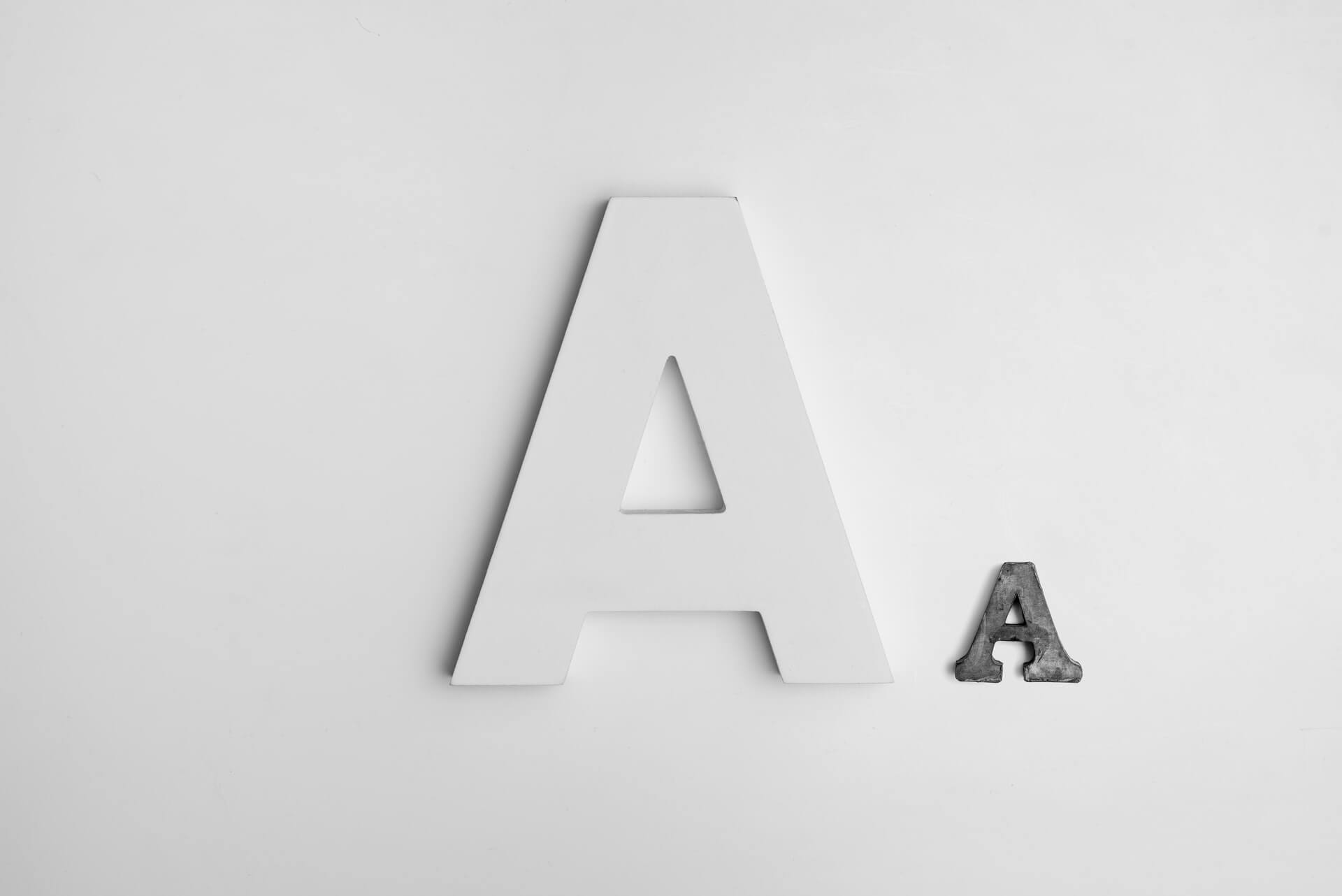
Typography refers to the appearance and style of language. It is essential to how people perceive your brand and should guide all design decisions. Fonts convey several meanings and values, all of which should align with the message of your brand as a whole.
Ensure the fonts you use for your website are web-safe, readable, and easy to read. You must use a web-safe font to communicate your brand effectively across all browsers and platforms. It’s crucial to comprehend the fundamental four forms of typography before selecting a font:
- Serif fonts
- Sans-serif fonts
- Script fonts
- Display fonts
Serif and sans-serif fonts
Whether to use a serif or sans-serif font is the most frequent question you should be asking yourself while selecting a font. Let’s first examine their visual differences before discussing when to employ each.
The small hook circled in serif fonts is not present in sans-serif fonts, as seen in the image above. It is simple to visually distinguish between the two because “sans” actually means “without.” You can use serif and sans-serif fonts for various designs and goods.
Sans-serif fonts stand out in large, bold titles, whereas serif fonts are easily visible in tiny copies. Sans-serif fonts are typically seen as “contemporary,” whereas serif fonts are read as “traditional.” As was said earlier, sans-serif typefaces are often geometric and plain, whereas serif fonts feature additional flourishes.
Display and script fonts
Consider display and script fonts and two other popular font categories. Large, striking typefaces called “display fonts” are employed for headlines or advertisements. They are difficult to read in the body copy or anything smaller than 14 points. They are not as widely used as serif and sans-serif typefaces.
Script fonts are frequently employed as ornamental elements. The script works well for quoting sources, creating headlines, and mimicking hand lettering. For lengthy body text, it is useless.
Top Fonts For Websites
It’s time to get into the specifics of this post by exploring our list of the top 10 fonts for websites. Given the abundance of fonts, narrowing this selection down to just ten fonts was difficult, but we’ve gathered the best of the best here for you to choose from. You can download and use a lot of these website fonts for free on Google Fonts.
Open Sans
Steve Matteson developed the sans serif font, Open Sans, first made available in 2011. The font stands out as one of the top ten fonts for websites thanks to its focus on readability, approachable design, and exceptional support for numerous languages.
Roboto
The font Roboto is a member of the neo-grotesque family of sans serif fonts. The term “grotesque” has a long history dating back to the 1800s, and designer Christian Robertson’s Roboto is a contemporary rendition of this genre. Roboto is included on this list because of its deft use of white space, which contributes to its distinctive, angular style. Roboto is a very popular free website font.
Montserrat
Montserrat is another one of the top web fonts available for free use. A geometric sans-serif font called Montserrat is simple to use in almost any place on your website. This font scales nicely since it is readable in both large and small sizes. This strong, modern font tends to appeal to the millennial generation.
Playfair Display
Playfair Display is a serif font with hints of femininity and an appealing, contemporary feel. For websites targeting femininity, this typeface is the ideal option. The more aesthetically beautiful this font is by nature, the lower the weight.
What to Keep in Mind When Choosing a Font
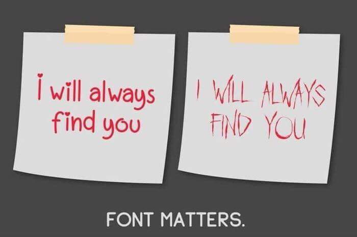
There are several factors to consider when selecting a font, including specific particular regarding the sector in which a firm operates and the message it wishes to deliver. But while you create websites for clients, there are certain general nuggets of wisdom to keep in mind. One of the most drastic examples can be seen in the screenshots below (fonts do matter).
Match the font with the business
The font type you use should be appropriate for the company, whether you’re developing a website for an IT firm or a small local tourism agency. This implies that the font should coordinate with the site’s other visual aspects and the business type.
Stick to the rule of three
A traditional typographic rule is to use three separate fonts in every design. Use a primary font for the headlines on websites, a secondary font for most of the text, and a third font to give accents to other web pages. It’s important to note that the primary font is so termed because visitors will notice it the most since it appears prominently in page headers, headings, etc., not because it is the font that is used the most frequently throughout a website.
Select web-safe fonts
It’s essential to pick typefaces you can correctly view on any browser or device. Or fonts that are pre-installed on the great majority of devices and browsers. Any typeface that satisfies this criteria is referred to be a web-safe font.
Thoroughly research the font
When researching a font, it’s essential to check that all famous letters, numbers, and symbols look nice. For example, the last thing you want is an eCommerce site with a typeface that overall looks okay but has odd dollar signs. The little things can make a big difference to your customers.
Prioritize mobile users
Font problems typically become more noticeable on mobile devices. Furthermore, picking one that looks bad would be negligent, given that mobile devices account for more than half of Internet traffic.
Font Mistakes to Avoid
Don’t Use Tacky Fonts
Never use Comic Sans. Tacky and quirky typefaces have no place on any websites that wish to be taken seriously, even though you might want to put them on your child’s birthday party invitation.
Every font style has its personality. Your font will convey a distinct message about your website and business, depending on your chosen design. For instance, the font “Papyrus” conjures images of ancient cultures. It looks like a font that belongs on the website for a movie about Egyptian mummies, not a website for financial planning.
While fun and hobby websites can use these gaudy fonts, don’t use them if you want your website to look professional.
Don’t Use Hard-to-Read Fonts
Selecting a font for your title, headline, or logo differs considerably from choosing a font for your main content. Readability is crucial because your website content aims to provide users with meaningful information about the goods or services you offer.
Don’t Crowd Your Line Spacing
Leaving enough space between each line is one of the simplest methods to make your material simpler to read. One hundred fifty percent of the font size you are employing is the golden percentage for the ideal line-height. For instance, the line-height will be 36px if you are using a 24px font size (which is 150 percent of 24px).
Don’t Use a Large Variety of Font Designs
For your website, you should pick no more than three fonts. Ideally, you should limit the number of font types you employ on your entire website to just two:
- A font style for page titles and headings
- A font selection for the primary content regions
- A quotation or subtitle font style (optional)
Any more than this may make your website design appear cluttered and perplexing, undermining the hard-earned brand identity you’ve worked so hard to create. Try to choose two fonts that go well together, known as a font pairing.
You should choose a font for headers and another for lengthier on-site material. It might be enjoyable to match up these two fonts. If you’re having trouble, Google Fonts offers pairing recommendations, and many free web tools are available to assist you.
Don’t Use Too Many Font Colors
A potent branding tool is color. What color(s), for instance, spring to mind when you think of Starbucks? The green you see in their emblem and on their website is probably it.
Only select one or two brand colors that accurately reflect you or your company when selecting colors for fonts to utilize in your headline or sub-headlines.
To make it easier to read, ensure your font color stands out against your background color. To verify sure your font color complies with readability standards, you can utilize free online tools like the WebAIM contrast checker.
Your website will look cluttered, and its content will be challenging to understand if you use too many colors, clashing colors, or inappropriate hues (such as lime green or pale yellow).
Don’t Pick Font Sizes At Random
Your content will look more unified if the font sizes are scaled in modules. This is a group of font sizes with the ideal proportion for being considered “beautiful” by the general audience.
Font sizes to use: 8, 16, 24, 32, 48, 64, and 95
The best font size for your main body text is 16 pixels. It significantly increases the readability of your paragraph because it is neither too little nor too large.
Use 8px for smaller text, such as date stamps, because it is too small for the primary copy. Feel free to experiment with larger font sizes for headings as you see fit!
Best Website Fonts – Conclusion
Our list of the top fonts for websites is now complete. Always remember that the font or font combination you select for your clients is not a simple choice. When you need a refresher on choosing fonts for websites and common mistakes to avoid, save this post and return to it later.
Clio Websites
Clio Websites is a full-service website design and marketing company in Calgary. We have loads of experience with responsive website design, website maintenance, WordPress development and support, and SEO. Clio offers free consultations and free website evaluations and we receive glowing reviews from our clients.
Picking the correct website fonts is a critical part of modern web design. Clio is always available and happy to answer any questions about website fonts so don’t hesitate to get in touch with us if you need help.
