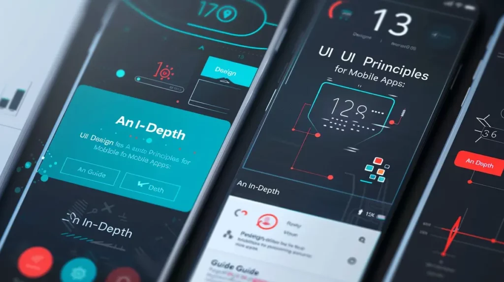
As more and more people access the web using their mobile devices, it’s important to ensure your business website or even personal blog is optimized for mobile devices and browsers. This blog post will provide the best practices for mobile web design and help you optimize your website for mobile users. We’ll also teach you how to get started with some of the most popular mobile-friendly frameworks and templates.

Responsive and Fast:
One of the basic mobile web design best practices is to make sure your website is responsive. This means that it will automatically resize and adapt to fit the screen size of the device being used. The layout should be easy to navigate, with large buttons and fonts that are easy to read. You can also consider using a mobile-friendly framework or template, such as Bootstrap, Foundation, or WordPress Mobile.
Another important consideration is your website’s loading time. Mobile devices have limited bandwidth and slower processors, so you need to make sure your pages are lightweight and load quickly. You can use the Google Page Speed Insights tool to test your website and get suggestions for improving its performance.
We have helped many clients improve their website speed which is one of the new ranking metrics Google uses to rank your website.
Layout and Navigation:
When designing your website for mobile, you’ll need to keep in mind the smaller screen size and limited space. This means that your website’s layout should be clean and simple, with plenty of white space to make it easy to read. You’ll also want to make sure your navigation is easy to use, with large buttons or links that can be easily tapped.
You should prefer using a hamburger menu, a popular mobile navigation pattern. This menu slides out from the side of the screen when you tap on the hamburger icon. It saves space and keeps your navigation hidden until it’s needed.

Images and Media:
When adding images or other media to your website, be sure to use responsive versions that will look good on all devices. You can also use a lightbox plugin to display images and videos in a popup window. This will keep your pages from loading slowly and make it easy for users to view media content.
Using large and inefficient images is one of the main issues that we see which can impact website performance. Having efficient images on a website is even more important when it comes to mobile web design.
And finally, be sure to test your website on different devices and browsers to ensure that it looks and works great on all of them. With these mobile web design best practices in mind, you should be well on your way to creating a website that is optimized for mobile users. If you’re looking for a professional mobile web design Calgary company, be sure to check us out!
Mobile Web Design Best Practices Pro Tips:
Make sure to follow our mobile web design tips for excellent mobile web design results. Here are a few of our favorite ones:
Using a responsive framework: Using a responsive framework like Bootstrap, WordPress, or Webflow, goes a long way and makes it easy to create mobile web design projects guaranteed to look great on every device.
Fast and efficient hosting: Having a fast and efficient hosting environment will help your website load quickly and get better results on mobile.
Use easily clickable buttons: The buttons should be big enough and easy to click on.
The text size should be easy to read: The content on your website should be easily readable, it should not be unnecessarily curvy & the font size should be large enough that the reader shouldn’t need to zoom in to read it.
Make menus easy and simple: Your website’s menus should be easy to find and use. Make the menus easy to locate and easy to click with your fingers.
Integrate better search and filters: Make sure that the search function on your website is easy to use and that the results are relevant. An excellent filter can also help customers see and purchase what they want and remove any distractions.
Be Available and Easily Reachable: Your contact information should be easy to find and use. Use the latest tech or even integrate Facebook Messenger or WhatsApp business tools to let the customers get in touch with you.
Clear and Concise CTAs: The call to action on your website should be clear and concise. Don’t add too many distractions and put the focus on the CTA.

Mobile Web Design Conclusion
As a webmaster or website owner, you can ensure that your mobile web design is optimized for mobile users by following these guidelines. Mobile web design is important for any business that wants to stay relevant in the digital age. This way, your website will be optimized for mobile devices, which are more important and widely used than desktop. Remember to always test your website on different devices and browsers to ensure that it looks and works great. And if you’re seeking a professional mobile web design company, be sure to check us out. We are Calgary web design and mobile web design specialists!
Clio Websites – Mobile Web Design Specialists
Clio Websites is a full-service website design and marketing company in Calgary. We have lots of experience with responsive website design, website maintenance, WordPress development and support, and SEO. Clio offers free consultations and free website evaluations and we receive glowing reviews from our clients. Check out our services page to find out more.
Clio is always available and happy to answer any questions you may have so don’t hesitate to get in touch with us.
What sets us apart
Clio offers interest-free payment plans and we receive glowing reviews from our clients. Here are a few things that set us apart from the competition. Clio Websites:
- Offers competitive pricing and flexible payment options
- Is a premier Calgary web design company with WordPress development expertise
- Has years of experience helping small businesses achieve their online goals
- Spends the time to understand your business needs and requirements
- Has a very high customer satisfaction and retention rate (over 98%)
- Prides ourselves on the quality of service we provide to each and every client
- Is responsive and won’t leave you hanging for days when you need support the most
- Creates custom websites for each project to separate you from your competition
How can I create a mobile website?
To create a successful mobile web design project, use a responsive framework such as Bootstrap, or WordPress which is mobile-friendly out of the box.
What is mobile friendly web design?
Mobile friendly web design ensures that websites look and function great on mobile and other devices. In this article, we talk about some popular mobile design best practices to ensure that your website looks great.
What are some mobile web design best practices?
Mobile friendly design practices include large text and buttons and are easily clickable. Using fast and efficient hosting, and tuned images is another mobile design best practice. In our article, we mention other mobile design best practices.