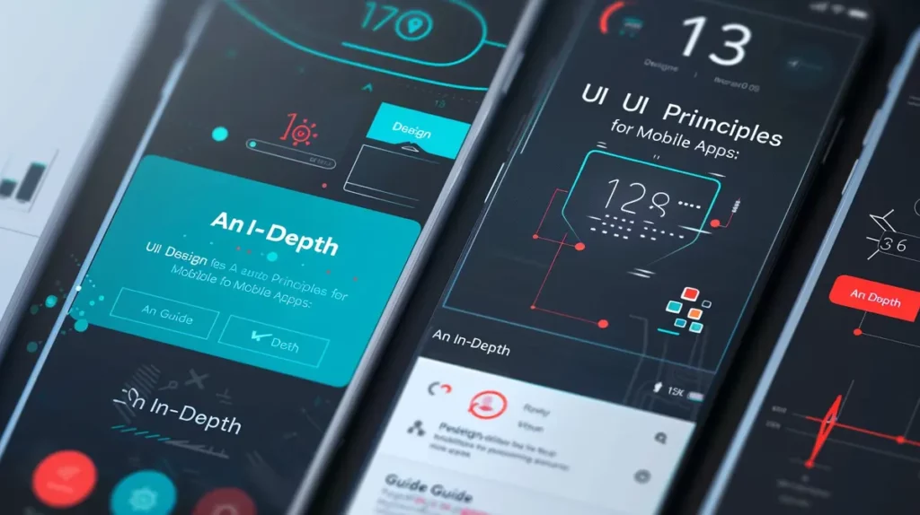
Many UI design resources tend to cover basic concepts. However, in this article, we’ll explore 10 advanced principles of UI Design that will take your work to the next level.
Let’s jump in.
1. Micro-interactions
Micro-interactions are small, contained moments within a user interface that revolve around a single task or interaction. They are often subtle and seamless, yet they play a crucial role in enhancing the overall user experience. Here’s an expanded look at how micro-interactions can be utilized effectively:
- Enhanced Feedback: Microinteractions provide immediate feedback to users, acknowledging their actions and confirming that something is happening. For example, when a user clicks a button, a subtle animation or color change can indicate that the action has been recognized by the system.
- Guiding User Attention: Microinteractions can be used to draw attention to important elements or guide users through a process. For instance, a pulsating animation on a new feature can prompt users to explore it, or a subtle arrow animation can indicate the direction in which a carousel can be scrolled.
- Delightful Experiences: Thoughtfully designed micro-interactions can add an element of delight to the user experience. Whether it’s a playful animation when a user achieves a milestone or a satisfying sound effect when completing a task, these small touches contribute to a memorable and enjoyable interaction.
- Visual Hierarchy and Affordance: Microinteractions can reinforce the visual hierarchy of elements within the interface and provide clues about their functionality. For example, a button that subtly grows in size when hovered over communicates its interactive nature, while a faded-out state indicates that it’s disabled.
- Progress Indication: Microinteractions can be used to communicate progress or loading states to users, reducing perceived wait times and keeping them engaged. Progress bars, spinners, or animations that convey activity can reassure users that their action is being processed.
- Error Handling: Microinteractions can also assist in error handling by providing informative feedback when users encounter issues. Highlighting fields with errors, displaying error messages with accompanying animations, or shaking an input field to signify an invalid entry can help users quickly identify and correct mistakes.
- Brand Personality: Microinteractions offer an opportunity to inject elements of brand personality into the interface. Whether it’s through unique animations, sounds, or visual effects, these micro-interactions can reinforce the brand’s identity and create a cohesive experience across different touchpoints.
- Contextual Relevance: Microinteractions can be tailored to the context in which they occur, providing relevant feedback and guidance based on the user’s current actions or environment. For example, in a messaging app, a typing indicator animation informs users that the other party is composing a message in real time.
- Mobile Optimization: In mobile interfaces, micro-interactions play an even more critical role due to the limited screen space and touch-based interactions. Gestures like swiping, pinching, or tapping can trigger micro-interactions that enhance navigation, provide feedback, or facilitate actions with minimal effort from the user.
- Accessibility Considerations: It’s essential to ensure that micro-interactions are accessible to all users, including those with disabilities. Providing alternative feedback mechanisms such as haptic feedback or auditory cues can make microinteractions inclusive and usable for everyone.

2. Progressive Disclosure
Progressive Disclosure is a design principle aimed at managing complexity in user interfaces by presenting information or functionality gradually, based on the user’s needs and context. Here’s an in-depth exploration of how Progressive Disclosure can be effectively implemented:
- User-Centered Design: Progressive Disclosure starts with understanding the user’s goals, tasks, and level of expertise. By conducting user research and usability testing, designers can identify which information or features are essential to display upfront and which can be deferred until later stages of interaction.
- Hierarchical Organization: Information architecture plays a crucial role in Progressive Disclosure. Designers should structure content and features hierarchically, prioritizing the most critical elements for initial presentation while relegating secondary or tertiary information to subsequent layers.
- Contextual Relevance: Progressive Disclosure tailors the presentation of information to the user’s current context or task. For example, in an e-commerce website, product details might be initially summarized in a compact format on a listing page, with the option to expand for more information when a user expresses interest.
- Tooltips and Hover States: Tooltips are small, contextual messages that appear when users hover over or interact with specific elements. They provide additional information or guidance without cluttering the interface. Designers can strategically use tooltips to offer explanations, definitions, or instructions where needed.
- Expandable Sections and Accordion Menus: Expandable sections allow users to reveal more detailed information or options within a compact space. Accordion menus, a common implementation of expandable sections, enable users to expand or collapse sections of content, maintaining focus and reducing cognitive load.
- On-Demand Help and Tutorials: Progressive Disclosure includes providing on-demand access to help resources or tutorials to assist users as they navigate through complex tasks or workflows. This could involve integrating contextual help icons or links that users can click to access relevant documentation or instructional content.
- Guided Tours and Walkthroughs: For new or unfamiliar interfaces, Progressive Disclosure can be facilitated through guided tours or walkthroughs that introduce users to key features and functionalities step by step. These tours should be concise, interactive, and skippable for users who prefer to explore independently.
- Conditional Display: Progressive Disclosure adapts the presentation of information based on user interactions or system events. For example, form fields might dynamically appear or disappear based on previous selections, ensuring that users are presented with only relevant options at each stage of interaction.
- Layered Interfaces: Progressive Disclosure often involves layering information or functionality across multiple screens or modalities. Designers should ensure smooth transitions between layers and provide clear navigation cues to help users navigate back and forth as needed.
- Feedback and Iteration: Progressive Disclosure should be continuously refined based on user feedback and iterative design cycles. By monitoring user interactions, analyzing user behavior, and soliciting user Input, designers can identify opportunities to streamline the disclosure process and optimize the user experience over time.
3. Motion Design
Motion Design is the art of using animated elements strategically within user interfaces to enhance usability, communicate information effectively, and create engaging experiences. Here’s a comprehensive expansion on how motion design can be leveraged to its fullest potential:
- Guiding User Attention: Motion can be employed to direct users’ focus towards important elements or actions within the interface. By animating key components such as buttons, icons, or calls-to-action, designers can draw users’ attention and guide them through the intended user flow.
- Conveying Hierarchy and Relationships: Motion can help convey the hierarchical structure of information and the relationships between different elements within the interface. For example, animations that reveal nested menus or expandable sections can visually illustrate the relationship between parent and child elements.
- Creating Visual Feedback: Motion provides immediate feedback to users, confirming their actions and indicating system responses. Animations like button presses, loading indicators, or transitions between screens serve as visual cues that reassure users that their interactions are being recognized and processed.
- Enhancing Navigation and Transitions: Motion can improve the perceived fluidity and seamlessness of transitions between different states or screens within the interface. Smooth animations for navigation, such as sliding panels or fading transitions, create a more cohesive and intuitive user experience.
- Establishing Context and Spatial Awareness: Motion can help users understand the spatial layout of the interface and their position within it. Animated transitions that simulate depth, such as parallax scrolling or 3D effects, provide users with a sense of context and orientation as they navigate through content.
- Improving Cognitive Load and Comprehension: Motion can aid in reducing cognitive load by visually simplifying complex interactions or conveying information more intuitively. Animations that break down multi-step processes into sequential actions or visually demonstrate cause-and-effect relationships help users better understand and retain information.
- Adding Personality and Branding: Motion design offers an opportunity to infuse the interface with elements of brand personality and style. By incorporating unique animations, transitions, or visual effects that reflect the brand’s identity, designers can create a cohesive and memorable user experience that resonates with users on an emotional level.
- Utilizing Principles of Timing and Easing: Effective motion design relies on careful consideration of timing and easing curves to create animations that feel natural and purposeful. Designers should pay attention to the speed and duration of animations, as well as the acceleration and deceleration patterns, to ensure that motion transitions smoothly and aligns with user expectations.
- Anticipation and Follow-through: Incorporating principles of anticipation and follow-through adds realism and dynamism to motion design. Anticipation involves preparing users for an upcoming action through subtle cues or preparatory animations, while follow-through ensures that motion transitions smoothly to the next state or action, preventing abrupt or disjointed movements.
- Accessibility Considerations: Motion design should be implemented in a way that is inclusive and accessible to all users, including those with disabilities. Designers should provide options to adjust or disable motion effects for users who may experience motion sensitivity or prefer a more static interface.
4. Personality and Branding
Infusing Personality and Branding into UI design goes beyond merely presenting information—it’s about creating a cohesive and memorable experience that reflects the essence of the brand. Here’s a comprehensive expansion of this concept:
- Brand Identity Exploration: Before diving into UI design, it’s crucial to thoroughly understand the brand’s identity, values, and target audience. Conducting brand workshops, analyzing brand guidelines, and studying market positioning can provide valuable insights into the brand’s personality and visual language.
- Typography: Typography plays a significant role in conveying brand personality and establishing visual hierarchy within the UI. Selecting fonts that align with the brand’s tone—whether it’s formal, playful, modern, or classic—can evoke specific emotions and create a consistent brand voice across various touchpoints.
- Color Palette: Colors evoke powerful associations and emotions, making them a potent tool for expressing brand personality. Choose a color palette that not only aligns with the brand’s identity but also enhances readability and accessibility. Utilize primary brand colors for key elements and accents, while secondary colors can add depth and variety to the interface.
- Iconography and Visual Elements: Custom icons and visual elements provide an opportunity to reinforce brand identity and communicate complex concepts more intuitively. Design icons that reflect the brand’s style and values, whether it’s through a minimalist, illustrative, or abstract approach. Consistency in style and visual language is key to maintaining brand coherence.
- Voice and Tone: Beyond visual elements, consider the language and tone used throughout the UI. Develop a style guide that outlines guidelines for writing copy, ensuring consistency in messaging and voice across different interactions. Whether the brand’s tone is authoritative, friendly, humorous, or professional, it should resonate with the target audience and reinforce brand values.
- Storytelling Through Design: Design is a powerful storytelling medium that can evoke emotions, convey narratives, and establish connections with users. Incorporate elements of storytelling into the UI design, whether through compelling imagery, interactive animations, or narrative-driven content. By weaving a cohesive narrative thread, designers can deepen users’ engagement and leave a lasting impression.
- Consistency Across Touchpoints: A strong brand presence requires consistency across all touchpoints, including websites, mobile apps, marketing materials, and physical products. Ensure that UI elements, such as logos, colors, typography, and imagery, remain consistent across different platforms to reinforce brand recognition and trust.
- User Experience as Brand Experience: Every interaction with the UI is an opportunity to reinforce the brand experience. Pay attention to every detail, from the loading animations to the checkout process, ensuring that each interaction reflects the brand’s values and enhances the overall user experience.
- User-Centric Branding: While it’s essential to stay true to the brand’s identity, it’s equally important to prioritize the needs and preferences of the target audience. Conduct user research, gather feedback, and iterate on the design to ensure that the UI resonates with users and fosters a positive brand perception.
- Continuous Evolution and Adaptation: Branding is not static; it evolves in response to market trends, user feedback, and changes in the competitive landscape. Regularly review and refine the UI design to stay relevant, innovative, and aligned with the evolving needs and expectations of both the brand and its audience.
5. Data Visualization
Data Visualization is the art and science of presenting data in a visual format that facilitates understanding, analysis, and decision-making. It involves transforming raw data into meaningful and actionable insights through the use of charts, graphs, maps, and other visual representations. Here’s a detailed expansion of this concept:
- Understanding Data: Before visualizing data, it’s crucial to thoroughly understand its context, structure, and underlying patterns. Conduct data analysis to identify key insights, trends, and relationships that need to be communicated to the audience.
- Choosing the Right Visualization: Different types of data call for different visualization techniques. Consider factors such as the type of data (e.g., numerical, categorical), the relationships between variables, and the audience’s preferences and expertise. Common types of visualizations include:
- Bar Charts and Line Graphs: Ideal for comparing values or showing trends over time.
- Pie Charts and Donut Charts: Useful for illustrating parts of a whole or proportions.
- Scatter Plots: Effective for visualizing correlations or relationships between variables.
- Heatmaps: Great for displaying data density or identifying patterns in large datasets.
- Tree Maps: Useful for visualizing hierarchical data structures.
- Bubble Charts: Effective for displaying three-dimensional data points with varying sizes.
- Visual Hierarchy and Clarity: Design visualizations with a clear hierarchy of information, emphasizing the most important insights while providing context for interpretation. Use visual cues such as color, size, and position to guide the viewer’s attention and make key insights stand out.
- Interactivity and Exploration: Incorporate interactive elements into data visualizations to enable users to explore and interact with the data dynamically. Features such as tooltips, zooming, filtering, and drill-down capabilities empower users to delve deeper into the data, uncovering insights that might not be apparent at first glance.
- Accessibility and Inclusivity: Ensure that data visualizations are accessible to all users, including those with visual impairments or cognitive disabilities. Provide alternative text descriptions for visual elements, use high-contrast color schemes, and offer keyboard navigation options to make visualizations usable for everyone.
- Contextualization and Annotation: Provide context and explanation for the data presented in visualizations to help users understand its significance. Use labels, captions, and annotations to highlight key points, provide additional context, and clarify complex concepts.
- Responsive Design: Optimize data visualizations for various screen sizes and devices to ensure a consistent and user-friendly experience across desktop, tablet, and mobile platforms. Implement responsive design principles such as fluid layouts and scalable graphics to adapt visualizations to different viewport sizes.
- Storytelling Through Data: Use data visualizations to tell a compelling narrative or convey a specific message. Structure visualizations in a sequence that guides users through the story, using transitions and annotations to provide context and emphasize key points.
- Iterative Design and Feedback: Iterate data visualizations based on user feedback, usability testing, and data analysis. Continuously refine the design to improve clarity, usability, and effectiveness in communicating insights to the audience.
- Ethical Considerations: Be mindful of the ethical implications of data visualization, including issues related to privacy, bias, and accuracy. Present data transparently and responsibly, providing proper context and acknowledging limitations to avoid misinterpretation or misuse of the information.
6. Adaptive Interfaces
Adaptive Interfaces represent a sophisticated approach to user interface design, where the interface dynamically adjusts and responds to users’ preferences, behavior, and contextual factors. Here’s a comprehensive expansion of this concept:
- Responsive Design: Adaptive interfaces incorporate responsive design principles to ensure optimal viewing and interaction experiences across a variety of devices and screen sizes. This involves fluid layout grids, flexible images, and media queries that adjust the interface’s appearance and functionality based on the device’s characteristics, such as screen resolution and orientation.
- Personalization: Personalization is a key component of adaptive interfaces, allowing the system to tailor content, features, and recommendations to individual users’ preferences and interests. This can be achieved through user profiling, behavior analysis, and data-driven algorithms that deliver personalized experiences based on past interactions, demographics, or explicit user preferences.
- Context Awareness: Adaptive interfaces leverage contextual information, such as location, time of day, device capabilities, and user environment, to dynamically adapt the interface to the user’s current context. For example, a weather app may adjust its interface to prioritize relevant information based on the user’s current location and weather conditions.
- Adaptive Content Delivery: Adaptive interfaces deliver content in a manner that suits users’ preferences, accessibility needs, and situational requirements. This could involve offering multiple presentation formats (e.g., text, audio, video) for the same content, allowing users to choose the most suitable option based on their preferences or constraints.
- Adaptive Menus and Navigation: Adaptive interfaces employ dynamic menus and navigation structures that evolve based on users’ interactions, preferences, and context. This may include adaptive menu layouts that prioritize frequently accessed features, contextually relevant navigation options based on the user’s current task, or adaptive search suggestions based on user input.
- Machine Learning and AI: Advanced adaptive interfaces harness machine learning and artificial intelligence algorithms to analyze user behavior, predict preferences, and personalize the user experience in real-time. These algorithms continuously learn from user interactions, refining their recommendations and adaptions to better serve individual users over time.
- Progressive Enhancement: Adaptive interfaces embrace the principle of progressive enhancement, where the user experience is optimized based on the capabilities of the user’s device and browser. This ensures that users with older devices or limited connectivity still receive a functional and usable experience, while users with newer devices benefit from enhanced features and interactions.
- Multimodal Interaction: Adaptive interfaces support multimodal interaction techniques, allowing users to engage with the interface through a variety of input methods, including touch, voice, gestures, and keyboard shortcuts. This enables users to choose the most convenient and natural interaction mode based on their preferences and situational context.
- User Feedback and Iteration: Adaptive interfaces incorporate mechanisms for gathering user feedback and iteratively refining the interface based on user input. This may involve soliciting feedback through surveys, user testing, or analytics tools, and using this feedback to make informed design decisions that improve the overall adaptiveness and usability of the interface.
- Ethical Considerations: When designing adaptive interfaces, it’s essential to consider ethical implications related to privacy, data security, and user consent. Designers should prioritize transparency, user control, and data protection to ensure that adaptive features enhance the user experience without compromising user trust or infringing on users’ rights.

7. Gestural Interfaces
Gestural Interfaces revolutionize user interaction by harnessing touch, gesture, and voice inputs to create intuitive and immersive user experiences. Here’s a detailed expansion on how designers can effectively integrate gestural interfaces into their designs:
- Understanding User Behavior: Before designing gestural interfaces, it’s crucial to understand how users naturally interact with devices and interfaces. Study common gestures users employ in everyday life, such as swiping, pinching, tapping, and voice commands, and incorporate these familiar gestures into the interface design.
- Platform and Device Considerations: Gestural interfaces should be tailored to the specific platform and device characteristics, such as screen size, input capabilities, and operating system conventions. Designers should account for differences between touch-based interactions on mobile devices, tablets, and desktops, ensuring that gestures are optimized for each platform.
- Natural and Intuitive Gestures: Design gestures that feel natural and intuitive, mimicking real-world interactions as much as possible. For example, swiping horizontally to navigate between pages or vertically to scroll through content mirrors physical actions users perform when handling physical objects like books or papers.
- Gesture Discoverability: Gestural interfaces should be discoverable, meaning users can easily learn and remember how to perform gestures without explicit instructions. Use visual cues, animation, and affordances to guide users and communicate the available gestures, ensuring they’re intuitive and easy to grasp.
- Consistency and Predictability: Maintain consistency in gesture design throughout the interface to create a cohesive and predictable user experience. For instance, use consistent swipe directions for similar interactions across different screens or modules, reducing cognitive load and making the interface more intuitive.
- Feedback and Response: Provide immediate and clear feedback when users perform gestures, confirming that the action has been recognized and indicating its outcome. This feedback could be visual (e.g., animation, color change), auditory (e.g., sound effect), or haptic (e.g., vibration), enhancing the user’s sense of control and engagement.
- Accessibility and Inclusivity: Ensure that gestural interfaces are accessible to users with diverse needs and abilities. Provide alternative input methods, such as keyboard shortcuts or voice commands, for users who may have difficulty performing physical gestures. Additionally, consider users with motor impairments or visual impairments when designing gesture-based interactions.
- Gesture Libraries and Guidelines: Leverage existing gesture libraries and platform-specific design guidelines to inform your design decisions and ensure compatibility with established user expectations. Platforms like iOS and Android provide comprehensive guidelines and resources for designing gesture-based interactions that adhere to platform conventions and best practices.
- Contextual Gestures: Design gestures that are contextually relevant to the user’s current task or interaction. For example, in a drawing app, pinch-to-zoom might be used to zoom in on the canvas, while in a map app, the same gesture could be used to zoom in on the map view. Tailoring gestures to specific contexts enhances usability and efficiency.
- Iterative Design and Testing: Iteratively prototype and test gestural interfaces with real users to gather feedback, identify usability issues, and refine the design. Conduct usability testing sessions to observe how users interact with the gestures, iterate based on their feedback, and continuously improve the interface’s usability and effectiveness.
8. Design for Emotion
Designing for emotion is about recognizing that users’ emotional responses play a significant role in their interactions with a product or interface. By intentionally incorporating elements that evoke positive emotions, UI designers can create experiences that are not only functional but also enjoyable and memorable. Here’s a detailed expansion on how to design for emotion:
- Understanding Emotional Design: Emotional design acknowledges that users form emotional connections with products and interfaces based on their experiences, perceptions, and interactions. This approach recognizes that emotions influence users’ attitudes, behaviors, and decision-making processes, shaping their overall satisfaction and loyalty.
- Emotionally Resonant Imagery: Visual elements such as images, illustrations, and graphics have the power to evoke specific emotions in users. Choose imagery that aligns with the brand’s personality and resonates with users’ preferences, aspirations, and values. Whether it’s using captivating photographs, charming illustrations, or vibrant colors, visually appealing imagery can elicit positive emotions and create a welcoming atmosphere.
- The tone of Voice and Language: The language used in the UI—whether in copy, labels, or messaging—plays a crucial role in shaping users’ emotional experiences. Adopt a tone of voice that reflects the brand’s personality and connects with users on a human level. Whether it’s being friendly, informative, playful, or empathetic, the language should resonate with users’ emotions and make them feel understood and valued.
- Storytelling and Narrative: Storytelling is a powerful tool for engaging users on an emotional level and creating a sense of connection with the product or brand. Incorporate storytelling elements into the UI design, such as narratives, scenarios, or user journeys, that unfold over time and resonate with users’ experiences and aspirations. By framing the user experience as a compelling story, designers can captivate users’ attention and evoke emotions that enhance engagement and enjoyment.
- Microinteractions and Animation: Microinteractions, such as animations, transitions, and feedback cues, can evoke emotions and add personality to the user experience. Use subtle animations to bring interfaces to life, convey personality, and delight users with unexpected moments of interaction. Whether it’s a playful loading animation, a charming hover effect, or a satisfying confirmation animation, thoughtful micro-interactions can create memorable and enjoyable experiences.
- Empathy and User-Centered Design: Empathy is at the core of emotional design, as it involves understanding users’ needs, feelings, and motivations. Design with empathy by putting yourself in the users’ shoes, anticipating their emotional responses, and designing experiences that address their emotional needs and desires. Consider conducting user research, empathy mapping, and persona development to gain insights into users’ emotional states and tailor the UI accordingly.
- Positive Affordances and Feedback: Design interfaces with positive affordances—visual cues and feedback mechanisms that guide users’ actions and reassure them of their progress. Use clear, intuitive design elements such as buttons, icons, and navigation cues that invite interaction and provide immediate feedback. Positive feedback, such as animations, sounds, or visual cues, reinforces users’ actions and enhances their sense of accomplishment and satisfaction.
- Surprise and Delight: Surprise and delight are essential elements of emotional design, as they can turn ordinary interactions into memorable moments of joy and wonder. Incorporate delightful surprises, Easter eggs, or unexpected rewards that exceed users’ expectations and evoke positive emotions. Whether it’s a hidden feature, a playful interaction, or a personalized message, surprises can leave a lasting impression and create a sense of delight and appreciation.
- Consistency and Coherence: While emotional design encourages creativity and expression, it’s essential to maintain consistency and coherence throughout the UI. Ensure that emotional elements—such as imagery, tone of voice, and storytelling—align with the brand’s identity and create a unified experience across all touchpoints. Consistency builds trust and familiarity, reinforcing users’ emotional connections with the product or brand over time.
- Ethical Considerations: When designing for emotion, it’s crucial to consider ethical implications related to emotional manipulation, psychological triggers, and user well-being. Designers should prioritize transparency, respect users’ autonomy, and avoid exploiting emotional vulnerabilities for manipulative purposes. Instead, aim to foster genuine emotional connections based on trust, empathy, and authenticity.
9. Cross-Platform Consistency
Cross-Platform Consistency is a fundamental principle in UI design aimed at providing users with a seamless and cohesive experience across various devices, operating systems, and screen sizes. Here’s an in-depth exploration of this concept:
- Understanding Cross-Platform Design: Cross-platform design acknowledges the diversity of devices and platforms users may interact with, including smartphones, tablets, desktop computers, and wearable devices. It recognizes that users expect consistency in functionality, visual appearance, and interaction patterns regardless of the device they’re using.
- Design Systems and Component Libraries: Design systems and component libraries serve as foundational frameworks for maintaining consistency across platforms. They include a set of reusable components, patterns, and guidelines that define the visual and interactive elements of the UI. By standardizing design elements such as buttons, navigation bars, typography, and color schemes, design systems ensure a unified look and feel across platforms.
- Platform-Specific Guidelines: While maintaining consistency is essential, it’s also crucial to respect the unique characteristics and conventions of each platform. Platforms like iOS, Android, and web browsers have their own design guidelines, interaction patterns, and user expectations. Designers should familiarize themselves with these guidelines and adapt the UI design to align with platform-specific conventions while maintaining brand consistency.
- Responsive and Adaptive Design: Responsive and adaptive design techniques enable UI elements to adapt and respond to different screen sizes, orientations, and resolutions. Fluid layouts, flexible grids, and scalable components ensure that the UI remains visually appealing and functional across a wide range of devices, from large desktop monitors to small smartphone screens.
- Device-Specific Optimization: While the core functionality and content should remain consistent across platforms, designers can optimize the UI for specific device capabilities and form factors. For example, mobile interfaces may prioritize touch-friendly interactions, while desktop interfaces may leverage keyboard shortcuts or mouse hover effects. Tailoring the UI to each device’s capabilities enhances usability and maximizes user engagement.
- User Context and Continuity: Cross-platform consistency extends beyond individual interactions to encompass the entire user journey across multiple devices. Designers should ensure continuity in the user experience, allowing users to seamlessly transition between devices without losing their progress or context. Features such as cross-device synchronization, session persistence, and single sign-on enhance the user experience and encourage engagement across platforms.
- Testing and Validation: Thorough testing is essential to ensure that the UI performs consistently across different devices, browsers, and platforms. Conduct usability testing with real users on various devices to identify any inconsistencies, usability issues, or platform-specific challenges. Iteratively refine the design based on user feedback and testing results to achieve optimal cross-platform consistency.
- Scalability and Maintainability: Design systems and component libraries should be scalable and easily maintainable to accommodate future updates, iterations, and platform changes. Establish clear documentation, version control, and governance processes to ensure that design assets remain up-to-date and accessible to all stakeholders involved in the design and development process.
- Accessibility and Inclusivity: Cross-platform consistency should extend to accessibility considerations, ensuring that the UI is usable and accessible to users of all abilities across different devices and platforms. Adhere to accessibility standards and guidelines, such as WCAG (Web Content Accessibility Guidelines), and conduct accessibility audits to identify and address any barriers to access for users with disabilities.
- Continuous Improvement: Cross-platform consistency is an ongoing effort that requires continuous monitoring, feedback, and iteration. Regularly gather user feedback, analyze usage metrics, and stay informed about emerging trends and platform updates to keep the UI design aligned with evolving user needs and technological advancements.
10. Usability Testing and Iteration
Usability Testing and Iteration are integral components of the UI design process, focused on refining and optimizing the user experience based on real user feedback and insights. Here’s a detailed expansion of this concept:
- User-Centric Approach: Usability testing puts the user at the center of the design process, ensuring that the interface meets their needs, preferences, and expectations. By observing users’ interactions firsthand, designers gain valuable insights into how users navigate the interface, where they encounter difficulties, and what features or elements resonate most positively.
- Identifying Pain Points: Usability testing helps uncover pain points and friction points within the UI that hinder users’ ability to accomplish tasks efficiently or effectively. These pain points could include confusing navigation, unclear instructions, slow loading times, or cumbersome workflows. By identifying and addressing these issues, designers can enhance the overall usability and user satisfaction of the interface.
- Gathering Feedback: Usability testing provides an opportunity to gather qualitative feedback from users about their experiences, preferences, and suggestions for improvement. Through interviews, surveys, and direct observation, designers can gain valuable insights into users’ thought processes, motivations, and pain points, helping them make informed design decisions.
- Quantitative Analysis: In addition to qualitative feedback, usability testing often involves quantitative analysis of user behavior and performance metrics. Techniques such as A/B testing, click-through rates, task completion rates, and time-on-task measurements provide objective data on the effectiveness of different design variations or features. This data-driven approach helps designers prioritize design changes and optimize the UI for maximum usability and performance.
- Iterative Design Process: Usability testing is an iterative process that involves continuous refinement and improvement based on user feedback and insights. Designers iterate on the design, making incremental changes to address identified issues and optimize the user experience. By testing multiple iterations with users, designers can validate design decisions, identify areas for improvement, and ensure that the final UI meets users’ needs and expectations.
- Incorporating Accessibility: Usability testing should include participants with diverse backgrounds, abilities, and accessibility needs to ensure that the interface is usable and inclusive for all users. Conducting accessibility testing alongside usability testing helps identify barriers to access and ensures that the interface complies with accessibility standards and best practices.
- Heatmaps and Session Recordings: Heatmaps and session recordings are valuable tools for gaining deeper insights into user behavior and interaction patterns. Heatmaps visually represent aggregated data on where users click, scroll, or hover within the interface, highlighting areas of interest or friction. Session recordings capture users’ interactions in real-time, providing rich qualitative data on navigation paths, interaction sequences, and user engagement.
- Remote Testing: In addition to traditional in-person usability testing, remote testing allows designers to gather feedback from a broader and more diverse pool of participants, regardless of geographical location. Remote testing tools and platforms enable designers to conduct moderated or unmoderated tests, gather feedback asynchronously, and analyze results efficiently.
- Collaborative Analysis and Decision-Making: Usability testing involves collaboration across multidisciplinary teams, including designers, researchers, developers, and stakeholders. Collaborative analysis of test results fosters shared understanding, promotes empathy for users’ needs, and facilitates consensus on design priorities and next steps.
- Continuous Improvement: Usability testing is an ongoing process that should be integrated into the design lifecycle from initial concept development to post-launch evaluation. By continuously monitoring user feedback, tracking key performance metrics, and iterating on the design based on evolving user needs and market trends, designers can ensure that the UI remains relevant, usable, and delightful over time.

Final Thoughts – The 10 Advanced Principles of UI Design
When it comes to the realm of design and the role of a designer, there are numerous factors to consider. However, these UI design tips offer a surefire way to simplify your design process.
Successful designers move beyond the fundamental principles of User Interface design and delve into advanced techniques that can enhance their work as UI/UX designers. A notable skill is the adept use and understanding of design tools, ranging from visual elements to UI kits and Design Systems. Harnessing these tools enables the creation of exceptional designs with efficiency and efficacy.
Another crucial aspect emphasized by these UI design tips is the importance of prioritizing users. Engaging in user research facilitates the design process for various user roles, ensuring that interfaces are both usable and relevant to all users, ultimately leading to a more favorable user experience.
Furthermore, actively seeking feedback is paramount for refining user interface designs. However, not all feedback holds the same weight. Utilizing our feedback template can assist in framing requests effectively, yielding optimal results.
Why Clio Websites
We hope that we helped to understand the principles of UI Design in web design. Our recommendations and techniques are based on years of experience helping businesses like yours.
At Clio, we have helped many clients grow their businesses with websites tuned for engagement and conversions.
Contact us if you would like us to help you create a unique website that your visitor will love.