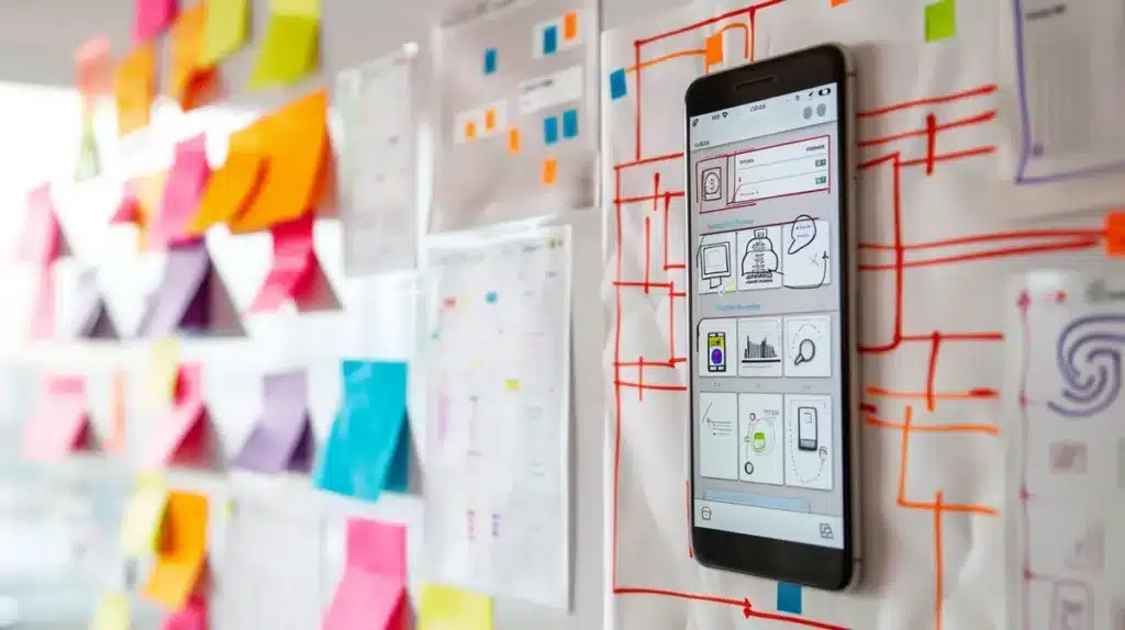
Crafting mobile applications that align with user expectations and preferences is paramount for their efficacy in today’s market. Yet, beyond mere aesthetics, a mobile app must adhere to precise design principles to truly excel. These principles serve as guiding lights, ensuring the app is not just visually pleasing but also intuitive, practical, and user-centric.
In this article, we’ll cover the fundamental UI Design Principles for Mobile Apps development and talk about their significance in shaping an app’s triumph in the competitive landscape.
1. Simplicity
- Clear Hierarchy: Arrange elements in a clear hierarchy, prioritizing the most important functions and content. Use visual cues such as size, color, and position to indicate hierarchy.
- Minimalism: Strive to achieve a minimalist design, only including elements that are essential for the user’s tasks and goals. Remove unnecessary buttons, text, or visual clutter that could distract or confuse users.
- Intuitive Navigation: Design navigation flows that are intuitive and easy to understand. Use familiar patterns such as tab bars, navigation drawers, or swipe gestures for navigation to ensure users can move through the app effortlessly.
- Progressive Disclosure: Present information progressively, revealing more details only when needed. This prevents overwhelming users with too much information at once and helps maintain focus on the task at hand.
2. Consistency
- Visual Consistency: Use consistent visual elements such as colors, typography, and iconography across all screens of the app. This creates a cohesive look and feel, making it easier for users to recognize and understand interface elements.
- Interaction Consistency: Maintain consistency in how users interact with the app. For example, use standard gestures like tapping, swiping, and pinching for common interactions. Consistent interaction patterns reduce cognitive load and enhance usability.
- Platform Guidelines Adherence: Adhere to the design guidelines provided by the platform (e.g., iOS Human Interface Guidelines or Material Design for Android). Platform-specific design patterns and conventions contribute to overall consistency and help users feel comfortable using the app within their familiar environment.
- Consistent Feedback: Ensure that feedback provided to users, such as button press animations or loading indicators, is consistent throughout the app. Consistent feedback reinforces user actions and maintains a sense of continuity in the user experience.

3. Clarity
- Clear Communication: Use concise and straightforward language in text labels, instructions, and error messages. Avoid jargon or overly technical terms that might confuse users. Ensure that the language used resonates with the target audience and is easily understandable.
- Iconography: Choose icons that are universally recognizable and intuitive. Avoid using obscure or abstract icons that require explanation. Provide tooltips or labels for icons if their meaning might not be immediately obvious to all users.
- Consistent Visual Language: Maintain consistency in visual elements such as icon style, button design, and color palette. Consistency helps users quickly understand the purpose and function of different interface elements, reducing cognitive load and enhancing usability.
- Whitespace and Breathing Room: Use whitespace effectively to create separation between different elements and improve readability. Adequate whitespace around text, buttons, and other interactive elements helps prevent visual clutter and makes the interface feel more spacious and organized.
4. Visibility
- Contrast: Ensure sufficient contrast between text and background colors to improve readability, especially for users with visual impairments. High contrast makes text and interface elements stand out, making them easier to see and interact with.
- Color Signifiers: Use color strategically to draw attention to important features or actions. For example, use a prominent color for primary action buttons to make them stand out. However, be mindful of colorblind users and ensure that color is not the sole means of conveying information.
- Hierarchy and Prioritization: Arrange interface elements in a visually hierarchical manner to guide users’ attention. Use larger, bolder, or more colorful elements to signify importance or priority. Establish a clear visual hierarchy to help users understand the relative importance of different elements on the screen.
- Progress Indicators: When tasks or processes take time to complete, provide visible progress indicators to reassure users and keep them informed. Progress bars, loading spinners, or percentage completion indicators help users understand how long they need to wait and reduce frustration.
- Call to Action (CTA) Design: Make important actions or features easily discoverable by prominently displaying them on the screen. Use clear labels and visually distinct buttons to encourage users to take desired actions. Avoid burying critical features deep within menus or screens, as this can lead to user frustration and abandonment.
5. Feedback
- Immediate Response: When users interact with elements in the app, provide immediate feedback to acknowledge their actions. For example, when a button is pressed, it should visually change or animate to indicate that the action has been recognized.
- Visual Feedback: Use animations, color changes, or micro-interactions to provide visual feedback. This not only confirms user actions but also adds a sense of responsiveness and dynamism to the app.
- Audio Feedback: Incorporate sound effects or auditory cues to complement visual feedback, especially in situations where users may not be looking directly at the screen. However, be mindful of not overusing sound, and provide options for users to disable it if desired.
- Error Feedback: When users make errors, provide clear and informative feedback on how to correct them. Avoid generic error messages and instead offer specific guidance to help users understand what went wrong and how to proceed.

6. User Control
- Non-intrusive Interactions: Design interactions that respect users’ autonomy and avoid interrupting their flow unnecessarily. Minimize intrusive pop-ups or modal dialogs that disrupt the user experience and require immediate attention.
- Clear Permissions: When requesting permissions or access to sensitive information, clearly explain why it’s needed and allow users to grant or deny permissions explicitly. Respect users’ privacy preferences and provide options to revoke permissions if desired.
- Undo and Redo: Provide mechanisms for users to undo or redo actions, especially for critical or irreversible operations. This empowers users to correct mistakes and maintain control over their interactions with the app.
- Customization Options: Offer customization options that allow users to tailor their experience according to their preferences. This could include settings for adjusting interface elements, enabling/disabling features, or choosing default behaviors.
7. Accessibility
- Screen Reader Compatibility: Ensure that the app is compatible with screen reader technologies used by visually impaired users. This involves providing alternative text for images, labeling UI elements correctly, and structuring content in a logical order for screen reader navigation.
- Support for Adjustable Text Sizes: Allow users to adjust the text size within the app to accommodate varying levels of visual impairment. Provide options for users to increase or decrease text size without sacrificing readability or functionality.
- Consideration for Color Blindness: Avoid relying solely on color to convey information or distinguish between elements. Use a combination of color, text labels, and other visual cues to ensure that important information is accessible to users with color vision deficiencies.
- Keyboard Navigation: Ensure that all interactive elements in the app can be accessed and operated using keyboard input alone. This is crucial for users who rely on keyboard navigation due to mobility impairments or other disabilities.
- High Contrast Mode: Offer a high contrast mode option for users who have difficulty distinguishing between colors or need enhanced visibility. High contrast modes increase the legibility of text and UI elements by emphasizing the contrast between foreground and background colors.
8. Content Focused
- Clear Information Architecture: Organize the app’s content in a structured and intuitive manner, making it easy for users to find what they’re looking for. Use clear categories, labels, and navigation paths to guide users to relevant content.
- Readable Typography: Choose fonts and font sizes that are legible on small screens and under various lighting conditions. Prioritize readability over decorative fonts, and ensure that text is properly spaced and aligned for optimal readability.
- Visual Hierarchy: Use visual hierarchy techniques such as typography, color, and contrast to prioritize important content and guide users’ attention. Important information should be prominently displayed, while less critical content can be presented in a less prominent manner.
- Content Prioritization: Prioritize content that is most relevant and valuable to users’ needs and goals. Avoid cluttering the interface with unnecessary elements or excessive advertising that detracts from the user experience.
- Responsive Design: Ensure that the app’s layout and content adapt gracefully to different screen sizes and orientations. This ensures that content remains accessible and readable across a wide range of devices, from smartphones to tablets.
9. Navigation
- Clear Navigation Structure: Design a clear and logical navigation structure that reflects the app’s content hierarchy. Use familiar navigation patterns such as tab bars, bottom navigation bars, or hamburger menus to help users quickly understand how to navigate the app.
- Consistent Navigation Patterns: Maintain consistency in navigation patterns throughout the app to provide a cohesive user experience. For example, if you use a tab bar for primary navigation on one screen, continue using it consistently across all relevant screens.
- Visual Feedback: Provide visual feedback to indicate the user’s current location within the app and their navigation path. Highlight active navigation elements, such as selected tabs or menu items, to reinforce the user’s spatial awareness and help them orient themselves within the app.
- Gestural Navigation: Utilize intuitive gesture-based navigation where appropriate, especially for actions like swiping between pages or dismissing modal dialogs. However, ensure that gesture-based interactions are discoverable and don’t interfere with other app functionalities.
- Progressive Disclosure: Employ progressive disclosure techniques to streamline navigation and reduce cognitive overload. Present navigation options progressively based on context, revealing deeper navigation levels or additional options only when relevant to the user’s current task.
10. Performance
- Efficient Resource Management: Optimize the app’s use of system resources such as memory, CPU, and battery to minimize performance bottlenecks. Close unnecessary background processes, cache data effectively, and manage memory usage efficiently to ensure optimal performance.
- Lazy Loading: Implement lazy loading techniques to defer the loading of non-essential resources, such as images or data, until they are needed. This helps reduce initial load times and conserves bandwidth, especially for content-heavy apps.
- Asynchronous Operations: Perform time-consuming tasks, such as network requests or data processing, asynchronously to prevent blocking the main UI thread. Use background threads or asynchronous APIs to ensure that the app remains responsive and fluid during these operations.
- Optimized Media Assets: Compress and optimize media assets, such as images, videos, and audio files, to reduce file sizes and improve loading times. Use modern image formats like WebP or AVIF and employ techniques like lazy loading and progressive loading to further optimize media delivery.
- Minimized Animations: Minimize the use of complex animations or transitions that could impact performance, especially on older or less powerful devices. Use animations judiciously and consider providing options to disable animations for users with performance concerns or accessibility needs.
11. Error Prevention and Recovery
- User-Friendly Forms: Design forms with clear labels, helpful placeholders, and inline validation to guide users and prevent input errors. Provide informative error messages that explain what went wrong and how users can correct their mistakes.
- Confirmation Dialogs: Use confirmation dialogs for critical actions, such as deleting data or making irreversible changes, to prevent accidental actions. Clearly communicate the consequences of the action and provide an option to cancel or undo if possible.
- Undo Functionality: Implement undo functionality where appropriate to allow users to easily revert unintended actions. This provides a safety net for users and reduces the risk of data loss or mistakes.
- Error Handling: Handle errors gracefully and transparently, avoiding cryptic error messages or technical jargon. Instead, use plain language and provide actionable suggestions for resolving the issue.

12. Platform Guidelines
- Design Language: Familiarize yourself with the design language and patterns recommended by the platform (e.g., Material Design for Android, Human Interface Guidelines for iOS). Follow these guidelines for UI elements, navigation patterns, and interactions to create a cohesive and consistent experience.
- Platform-Specific Features: Take advantage of platform-specific features and capabilities to enhance your app’s functionality and integration with the operating system. This includes features such as push notifications, widgets, or system-level integrations that provide added value to users.
- Performance and Compatibility: Ensure that your app performs well and is compatible with the latest versions of the platform. Stay updated with changes and updates to platform guidelines and APIs to maintain compatibility and take advantage of new features and improvements.
13. User Feedback Integration
- Feedback Channels: Provide multiple channels for users to submit feedback, including in-app feedback forms, contact emails, or social media channels. Make it easy for users to share their thoughts and suggestions directly from within the app.
- Regular User Testing: Conduct regular usability testing sessions with real users to gather feedback on the app’s usability, functionality, and overall user experience. Use feedback to identify areas for improvement and prioritize feature enhancements or bug fixes.
- Iterative Design Process: Adopt an iterative design process that incorporates user feedback at each stage of development. Continuously refine and iterate on the app based on user input to ensure that it meets the evolving needs and expectations of its users.
- Community Engagement: Foster a sense of community around your app by engaging with users through forums, social media, or dedicated user communities. Encourage users to share their experiences, offer feedback, and participate in discussions about the app’s development and future direction.
Conclusion – UI Design Principles for Mobile Apps
In conclusion, design principles are paramount for the triumph of mobile apps. An exemplary app prioritizes user-centricity, clarity of purpose, and aesthetic appeal. It must also offer intuitive navigation, consistency, accessibility, and top-notch performance. By adhering to these principles, mobile app designers can craft compelling experiences that exceed user expectations and ensure app success.
Why Clio Websites
We hope that by reading this article helped you understand UI design principles for mobile app design better. Our recommendations and techniques are based on years of experience helping businesses like yours.
At Clio, we have helped many clients grow their businesses with websites tuned for engagement and conversions.
Contact us if you would like us to help you create a unique website that your visitor will love.


