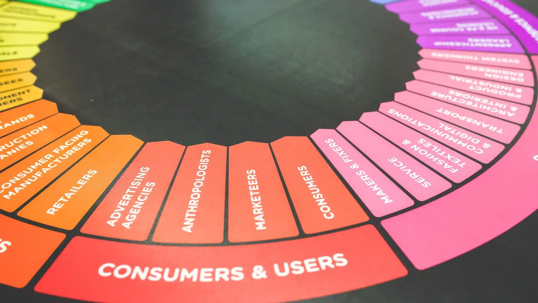
Color holds immense power in the world of web design, influencing user experiences, emotions, and perceptions.
By understanding the principles of color theory in web design and leveraging color psychology, web designers can create visually captivating and emotionally impactful websites.
In this article, we will:
- Delve into why color matters in web design
- Take a brief look into the historical significance of color
- Explore key color theory terms
- Discover how to apply an effective color scheme
- Understand how to use color psychology and meaning to influence emotions
- Consider important factors when using color psychology
- Learn how to effectively use color theory on your website
Why does color matter in web design?
Color plays a crucial role in web design as it has the ability to evoke emotions, convey meaning, and create visual impact. It can influence user behavior, grab attention, and communicate messages. They have the power to create a welcoming and engaging atmosphere or evoke a sense of urgency and excitement.
Colors can help establish brand identity, guide users through a website, and enhance the overall user experience. Therefore, understanding and effectively using color is essential for designing visually appealing and effective websites.
A Brief Look Into Color History
To fully appreciate the impact of color in web design, it is worth exploring its rich history. Colors have held cultural, symbolic, and artistic significance throughout civilizations. From ancient cave paintings to the magnificent works of art in different periods, color has played a vital role in human expression and communication.
The historical context of color helps us understand its evolution, meaning, and the emotional associations it carries. By understanding color history, we can gain insights into the timeless impact color has on visual communication.
Key Color Theory Terms You Should Know
The world of color theory is vast and fascinating, offering designers a plethora of tools and techniques to create visually captivating and harmonious designs. To navigate this realm effectively, it is essential to familiarize yourself with key color theory terms that form the foundation of understanding color relationships, combinations, and effects.
In this article, we will delve into seven key color theory terms and explore their significance in the world of design.
What is the color wheel and why is it important?
At the heart of color theory lies the color wheel. The color wheel is a visual representation of colors arranged in a circular format, demonstrating the relationship between different hues. It provides a systematic approach to understanding color relationships and aids in the selection of harmonious color combinations.
By studying the color wheel, designers can gain insights into complementary, analogous, and triadic color schemes, which form the basis of creating visually appealing designs.
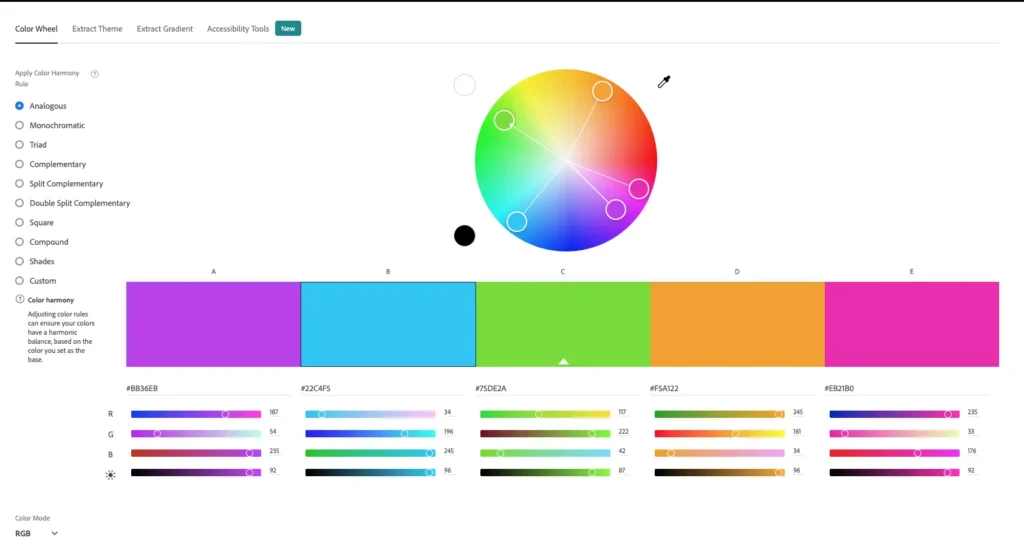
How do different colors relate to each other in a design?
Colors interact with each other in various ways, creating different relationships that impact the overall visual composition. Understanding these relationships is crucial for creating balanced and harmonious designs.
Complementary colors, positioned directly opposite each other on the color wheel, create high contrast and visual excitement.
Analogous colors, located adjacent to each other, produce a harmonious and cohesive effect.
Triadic colors, evenly spaced around the color wheel, offer vibrant and dynamic color schemes.
By considering color relationships, designers can achieve visual balance and evoke specific emotions.
What is color warmth and how does it impact the viewer?
Color warmth refers to the perceived temperature of color and plays a significant role in influencing emotions and setting the mood of a design.
Warm colors, such as red, orange, and yellow, evoke feelings of energy, enthusiasm, and excitement. These colors are associated with warmth, vitality, and positivity.
On the other hand, cool colors like blue, green, and purple create a sense of calmness, tranquility, and reliability. They are often associated with nature, serenity, and stability.
Understanding color warmth allows designers to deliberately evoke desired emotional responses and establish the intended atmosphere within a design.
What are the commonly used color systems in web design?
Color systems are fundamental to the world of design, providing standardized approaches to representing and manipulating colors across various mediums.
Three commonly used color systems are RGB (Red, Green, Blue), CMYK (Cyan, Magenta, Yellow, Black), and HEX (Hexadecimal).
RGB is used primarily for digital displays, with red, green, and blue values combined to create a wide spectrum of colors.
CMYK is used for printing purposes, with cyan, magenta, yellow, and black inks combined to produce a range of colors.
HEX codes provide alphanumeric representations of colors specifically for web design.
Understanding and utilizing these color systems allows designers to achieve consistent and accurate color representation across different platforms.
What are tints and shades, and how can they enhance a color scheme?
Tints and shades refer to variations of a color created by adding white or black, respectively. Tints are lighter versions of color, while shades are darker.
By adjusting the amount of white or black added to a color, designers can create subtle variations that add depth and dimension to a color palette. Tints can evoke a softer and more delicate appearance, while shades add richness and intensity.
The use of tints and shades provides designers with a wide range of options for creating visual interest and establishing hierarchy within a design.

What do hue, saturation, and lightness refer to in color theory?
Hue, saturation, and lightness are important attributes of colors that influence their visual impact.
Hue refers to the purest form of a color, such as red, blue, or yellow.
Saturation represents the intensity or purity of a color, with highly saturated colors appearing vibrant and vivid, while desaturated colors appear more muted.
Lightness, also known as value or brightness, refers to the perceived brightness or darkness of a color.
By manipulating these attributes, designers can create a wide range of visual effects, establish mood, and convey specific messages within their designs.
How does contrast play a role in creating visually interesting designs?
Contrast is a powerful tool in design that involves the difference in color values between elements. It helps create visual interest, highlight important information, and establish a clear hierarchy. By using contrast effectively, designers can improve readability, guide user attention, and create dynamic compositions.
Contrast can be achieved through variations in color, lightness, or saturation. By carefully considering contrast, designers can ensure that their designs are visually appealing, engaging, and communicate information effectively.
How To Apply An Effective Color Scheme
Now that we have explored key color theory terms, let’s dive into how to apply an effective color scheme in web design. Designers must consider several factors when choosing colors for a website, including brand identity, target audience, and the emotions they want to evoke.
Selecting a primary color as the foundation of the color scheme is a good starting point. From there, designers can choose complementary or analogous colors to create harmony and visual interest. It is also important to ensure sufficient contrast between elements to enhance readability and accessibility.
You can check out this website color tester tool to pick the right colors for your website.
How to Use Color Psychology and Meaning to Influence Emotions
Colors have psychological associations and can evoke specific emotions in individuals. By understanding these associations, web designers can harness the power of color psychology to create emotionally engaging user experiences. Let’s explore the emotions and meanings commonly associated with some colors:
Red
Often associated with passion, energy, and urgency. It can stimulate appetite and create a sense of excitement. Red can be used strategically to draw attention and convey a sense of importance.
Orange
Conveys warmth, enthusiasm, and creativity. It is often used to promote a sense of adventure and vitality. Orange can add a playful and energetic touch to a design.
Yellow
Represents happiness, optimism, and intellect. It can grab attention and convey a cheerful and friendly vibe. Yellow is often used to create a sense of positivity and warmth.
Green
Symbolizes growth, harmony, and nature. It is often associated with health, wealth, and sustainability. Green can create a sense of calmness and freshness in a design.
Blue
Evokes feelings of calmness, trust, and reliability. It is commonly used in corporate and professional settings. Blue can create a sense of security and professionalism.
Purple
Signifies luxury, creativity, and spirituality. It can create a sense of mystery and elegance. Purple is often used to add a touch of sophistication and creativity to a design.
Pink
Represents femininity, romance, and tenderness. It is often associated with sweetness and youthfulness. Pink can evoke a sense of playfulness and gentleness.
Black
Symbolizes sophistication, power, and elegance. It can add a touch of mystery and formality to a design. Black is often used to create a sense of luxury and exclusivity.
White
Conveys purity, simplicity, and cleanliness. It is often used to create a minimalist and modern aesthetic. White can create a sense of openness and clarity in a design.
While color psychology offers valuable insights, it is important to consider cultural differences, personal associations, and context. Different cultures may attribute different meanings to colors, and individual experiences can shape perceptions. Additionally, designers should balance the emotional impact of colors with usability and accessibility considerations. Ensuring that color choices do not hinder readability and accessibility for users with visual impairments is crucial.
How to Use Color Theory On Your Website
To effectively use color theory on your website, start by considering your brand’s identity and values. Select colors that align with your brand message and evoke the desired emotions in your target audience. Use color strategically to guide users’ attention, differentiate elements, and create a visually pleasing hierarchy. Pay attention to color contrast, readability, and accessibility to ensure a positive user experience for all visitors. Remember to test and iterate your color choices based on user feedback and analytics to continuously improve the overall design.
Conclusion – Color Theory in Web Design
In conclusion, color holds immense importance in web design. By understanding color theory, applying an effective color scheme, and leveraging color psychology, web designers can create visually captivating and emotionally impactful websites. Color has the power to evoke emotions, convey meaning, and create visual impact.
However, designers must also consider cultural differences, individual associations, and accessibility when using colors. By effectively using color theory, designers can enhance the user experience, communicate messages, and create visually engaging websites that leave a lasting impression on visitors.
Why Clio
We hope that you enjoyed reading about the importance of color theory in web design. Our recommendations and techniques are based on years of experience helping businesses like yours.
At Clio, we have helped many clients grow their businesses with websites tuned for engagement and conversions.
Contact us if you would like us to help you create a unique website that your visitors will enjoy coming back to.