
Let’s face it: in today’s world, a mobile friendly website is no longer an option, it’s a necessity. With 5.44 billion mobile internet users worldwide and counting, having a site that’s optimized for mobile devices is critical for reaching and engaging with your audience.
Not only does it improve user experience, but it also boosts your search engine rankings, driving more traffic and ultimately more business.
With the ever-increasing number of mobile users, it’s vital to meet their expectations for a seamless browsing experience. Mobile users have little time and attention span, and they demand a website that loads quickly, is easy to navigate and read on their smaller screens, and delivers information clearly and concisely.
Ignoring mobile optimization can result in high bounce rates, low engagement, and missed business opportunities. Plus, search engines prioritize mobile-friendly sites, so not optimizing your website can harm your search engine rankings.

Still Not Convinced? We got you!
You have to understand that people around you are glued to their smartphones. So the chances of someone stumbling upon your website on their mobile device are incredibly high.
If you neglect the mobile experience when designing your website, you risk missing out on a lot of potential traffic and customers.
Here’s a scenario: A small business owner needs to purchase a new accounting software to keep track of their finances.
They pull out their smartphone during a quick break and start searching for options online.
They come across your company’s website, but the mobile version is a nightmare to navigate.
The font is too small, the buttons are too close together, and the pages take forever to load.
Frustrated, they close the tab and move on to your competitors who have a user-friendly mobile website. You may have the best accounting software out there, but if your website isn’t optimized for mobile devices, potential customers will look elsewhere.
Here’s another example: A potential customer is browsing your online store, looking for the perfect product to buy.
They finally find what they’re looking for and click on the “Add to Cart” button – but instead of being taken to their shopping cart, the button disappears and they’re left staring at the same page.
Confused, they abandon their cart and go to a competitor’s website with a seamless checkout process. You’ve lost a sale.
Say “Yes” to Mobile-Friendly Website Design
Know that a clunky website is like a highway with potholes—it’ll make your visitors want to turn back and find a smoother ride elsewhere. In the age of mobile-first browsing, users expect seamless experiences, whether they’re on their phones or desktops.
And if your website fails to deliver, they won’t hesitate to hit that back button and choose a competitor instead. A bad user experience can not only damage your reputation but also harm your search engine rankings.
Improving mobile experience may not be easy, but it’s definitely worth the effort. By embracing key mobile-first principles, you can create a user-friendly platform that keeps your visitors coming back for more.
Here are some to help you get started.

Principle #1: Simplify the Interface
Designing for mobile presents unique challenges, and one of the biggest is simplifying the interface. With limited screen real estate, every pixel counts, and cluttered designs can lead to confusion and frustration for users.
To create a seamless user experience, you need to simplify your interface and prioritize the most important information. Do not overwhelm your users with too many options, but rather guide them towards the most relevant content.
Utilize clear typography, intuitive icons, and whitespace to help users navigate through your app or website. Remember, simplicity is not just about aesthetics, but also about functionality.
By simplifying the interface, you’re making it easier for your users to achieve their goals and complete tasks. When designing for mobile, aim for clarity above all else.
Principle #2: Navigation is Key
Just like with a simple interface, clear and intuitive navigation is crucial to a user-friendly mobile experience. Users should be able to find what they need quickly and easily without feeling overwhelmed. You need to keep those menus short and sweet, and make sure the most important pages are easily accessible.
Consider using visual cues like icons and colors to guide users through your mobile site. Also, remember to optimize your navigation for touchscreens—make buttons large enough for fingers and leave enough space between them to prevent accidental clicks.
And yes, don’t forget about the importance of consistency. Your mobile navigation should be consistent with your desktop site and other touch points to create a seamless user experience.
For example, take a look at Airbnb’s mobile app—they use clear icons and colors to guide users through the booking process and make it easy to navigate.
Principle #3: Craft Responsive Design
Yes, creating a mobile-friendly website is super important and something that cannot be ignored.
Responsive design basically allows your site to adapt to different screen sizes and orientations, ensuring a seamless user experience across all devices. However, it’s not just about fitting content onto a smaller screen.
You need to consider the hierarchy of information and how it’s presented on mobile. This means prioritizing key content and making it easily accessible.
A mobile-first approach to design is a great way to ensure your site is optimized for smaller screens. This involves designing for the smallest screen first and then scaling up.
It also means thinking about touch navigation and how users interact with your site on a mobile device. Clear and concise headings, easy-to-tap buttons, and intuitive navigation are essential.
But responsive design isn’t just about aesthetics. It can impact your site’s performance and search engine ranking. Google now prioritizes mobile-friendly sites in its search results, so it’s crucial to get it right.
When implementing responsive design, testing is key. Use tools like Google’s Mobile-Friendly Test to check how your site looks on different devices. User testing is also important to see how real users interact with your site and identify any pain points.
Principle #4: Leverage the Power of Empathy
To create a mobile design that truly resonates with your audience, empathy is key. Start by acknowledging that you are not your audience and seek to understand their needs, pain points, and behaviors.
This requires talking to users, observing their interactions with your website, and getting a sense of their emotions and motivations. By doing so, you’ll uncover recurring obstacles that can be addressed through thoughtful redesign.
One powerful tool for leveraging empathy is the creation of a customer journey map.
This visual representation of your typical user’s experience with your company helps you understand what your customers want from your business, how they use your product, and any difficulties they encounter along the way.
By mapping out the entire customer journey, you can identify areas where you can improve your mobile design to better serve your users.
For example, let’s say you’re designing a mobile app for a fitness brand. By talking to users and creating a customer journey map, you discover that many users are struggling with motivation to exercise consistently. With this insight, you can design features that encourage and support regular workouts, such as personalized workout plans, reminders, and a supportive community.
Keep in mind that empathy is not just a nice-to-have in mobile design, it’s a critical component of creating a successful product that meets your users’ needs. So take the time to listen, observe, and empathize with your audience, and let their insights guide your design decisions.
Principle #5: Focus on Speed
Let’s talk about website speed and mobile-friendly design. Neglecting website speed can lead to frustrating user experiences, which can hurt your website’s reputation and business.
When designing for mobile, consider the interaction cost—the physical and mental effort required to perform actions. Longer load times, complicated menus, and small text can all contribute to higher interaction costs.
To avoid this, optimize your site’s loading times and simplify your design. As discussed above, users should be able to navigate your site with ease and without having to jump through hoops.
Don’t let slow loading times and complicated design scare your users away—prioritize website speed for a mobile-friendly experience.
Is a Mobile Friendly Website Worth It? Conclusion
As the world becomes increasingly mobile-centric, it’s more important than ever for online businesses to adopt a mobile-first approach. It’s not just about having a responsive website—it’s about designing with mobile users in mind from the outset. This means considering the unique needs and preferences of mobile users, such as their on-the-go mindset, smaller screens, and touch-based interactions.
Of course, making the shift to mobile-first can be a significant investment of time, effort, and resources. But the payoff is worth it. By creating a seamless mobile experience for your users, you’ll not only improve their satisfaction and engagement with your brand, but also increase the chances of converting them into loyal customers.
To get started, take a step back and evaluate your website’s current mobile performance. What works well and what could be improved? Don’t be afraid to seek out feedback from real mobile users and incorporate their insights into your design process. And remember, designing for mobile is an ongoing process—you’ll need to continually iterate and refine your approach to stay ahead of the curve.
So, if you haven’t yet adopted a mobile-first mindset, now is the time to start. Your users—and your business—will thank you for it.
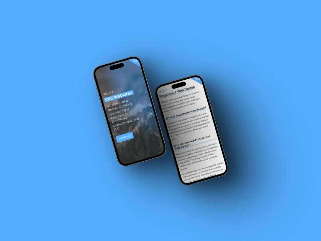
About Clio Websites
Clio Websites is a full-service website design and marketing company in Calgary. We have vast experience in responsive website design, website maintenance, WordPress development and support, and SEO. Clio offers free consultations and free website evaluations and we receive glowing reviews from our clients.
We are always available and happy to answer any questions you may have so don’t hesitate to get in touch with us.
FAQs
Is a mobile friendly website worth it?
A mobile-friendly website is no longer an option, it’s a necessity. With 5.44 billion mobile internet users worldwide and counting, having a site that’s optimized for mobile devices is critical for reaching and engaging with your audience.
What are the benefits of having a mobile website?
Not having a mobile website can result in users abandoning your site if they are on a mobile device and your website is slow to load or not mobile-friendly. In some industries, mobile traffic amounts to almost 50% of all visits. If your website isn’t mobile-friendly, you could be missing out on leads and customers.
Does mobile friendly affect SEO?
Yes, a mobile-friendly website is better for SEO than a website that only works on desktop devices. It’s better because it improves user experience, aligns with Google’s mobile-first indexing, offers faster page load times, enhances social sharing, and reduces bounce rates.