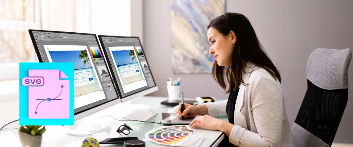
Scalable Vector Graphics, often referred to as SVG, stands as a highly adaptable and prevalent XML-based vector image format. It distinguishes itself from the conventional raster image formats by its remarkable trait of being resolution-independent. This unique attribute implies that SVG graphics can be resized, both up and down, to accommodate different display sizes and dimensions without any degradation in quality.
SVG achieves this feat by representing graphics in a two-dimensional space through a combination of defined lines, geometric shapes, and a diverse palette of colors. The elegance of SVG lies in its capacity to describe images as a series of mathematical formulas and geometric attributes, creating a description that’s not constrained by pixel grids. Instead, it uses vector paths and coordinates to depict images, making it an exceptional choice for a wide range of graphical elements in web design.
In essence, SVG is like a mathematical blueprint for creating visuals on the web, and its distinctive features have earned it a prominent place in the realm of web design. Its ability to provide crisp, clear graphics that remain sharp and vivid, regardless of the screen or device they are viewed on, makes it a preferred choice for creating logos, icons, illustrations, and interactive components within web pages.
Advantages of SVG in Web Design
Scalable Vector Graphics (SVG) offers a host of advantages that make it an invaluable asset in web design, enhancing the visual and interactive elements of websites. In this section, we will delve into the key benefits that SVG brings to the table.
Scalability
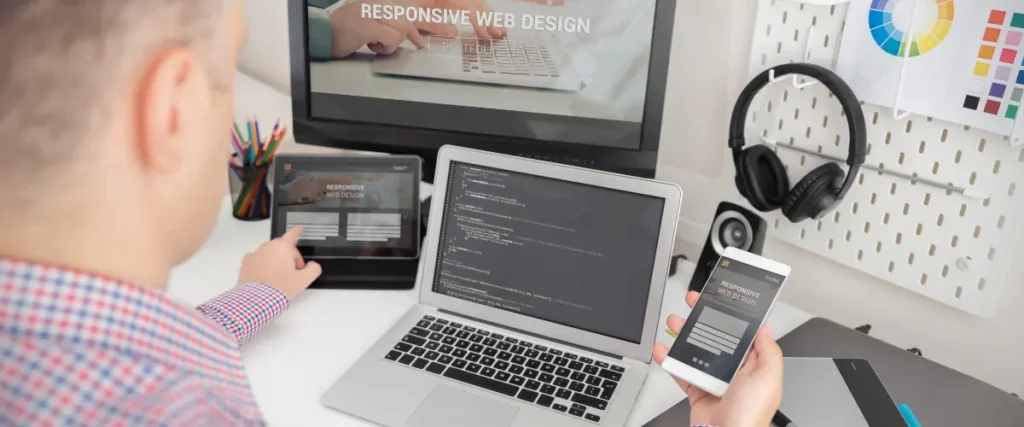
One of the most compelling features of SVG is its inherent scalability. Regardless of the screen size, resolution, or device on which it is displayed, an SVG graphic remains crisp and clear. This is because SVG is not based on a fixed grid of pixels, as is the case with raster images, but rather on mathematical descriptions of shapes and lines. As a result, SVG graphics can be scaled up or down without any loss of quality, ensuring that your visuals look impeccable on everything from large desktop monitors to tiny mobile screens.
High Quality and Resolution
SVG is synonymous with high-quality graphics. Because SVG files are essentially descriptions of shapes and paths, they are resolution-independent. This means that SVG images can maintain their sharpness and clarity at any level of magnification. The absence of pixelation or blurriness is a boon for web designers looking to create stunning visuals, icons, and logos that stand out with pristine detail and sharp lines.
Small File Sizes
Efficiency is another area where SVG shines. Unlike some other image formats, SVG files are typically quite small in size. This is because they consist of text-based XML code, which is highly compressible. Smaller file sizes are beneficial for web performance as they result in quicker loading times, reducing the strain on both servers and the user’s device. This makes SVG a preferred choice for web designers aiming to create visually appealing content without compromising on page speed and performance.
Accessibility
Accessibility is a fundamental concern in modern web design. SVG offers excellent accessibility features by allowing for the inclusion of metadata and descriptive text within the graphic itself. This is particularly important for screen readers and assistive technologies, ensuring that all users, regardless of their abilities, can access and understand the content. SVG’s accessibility features empower web designers to create inclusive and user-friendly experiences.
Interactivity
SVG is not limited to static images; it can also facilitate interactivity. Through the use of JavaScript and CSS, SVG graphics can respond to user actions, such as mouse clicks and hover events, enabling the creation of dynamic and engaging web elements. This interactivity opens up a world of possibilities for web designers, from interactive maps and data visualizations to animated icons and user interface components.
SVG’s advantages in web design are clear and multifaceted. Its scalability, high quality, small file sizes, accessibility features, and interactivity make it a versatile tool for creating visually appealing, responsive, and inclusive web content. These advantages ensure that SVG remains a go-to choice for designers seeking to deliver exceptional user experiences and design quality.
Common Use Cases for SVG in Web Design
Scalable Vector Graphics (SVG) are not just a versatile tool; they are also exceptionally well-suited for a range of common use cases in web design. In this section, we will explore how SVG is frequently employed to enhance various aspects of web content.
Icons and Logos
Icons and logos are the visual cornerstones of a website’s identity. SVG is a natural choice for creating icons and logos due to its ability to maintain sharpness and clarity at any size. Designers can craft intricate, detailed icons that look stunning on high-resolution displays, without the need for multiple versions of the same graphic. SVG icons and logos are also easily customizable through CSS, enabling dynamic changes in color and style to match the website’s theme or user interactions.
Infographics
Infographics are powerful tools for conveying complex information in an easily digestible format. SVG’s vector nature allows for the creation of intricate and data-rich infographics that remain sharp and legible when zoomed in. Whether it’s charts, diagrams, or flowcharts, SVG graphics can be a pivotal element in transforming data into a visually engaging narrative.
Data Visualization
Data visualization is at the heart of modern web applications, and SVG offers a range of possibilities for representing data. From interactive charts and graphs to geographic maps, SVG’s scalability and interactivity make it an excellent choice. Web designers can use JavaScript libraries or frameworks to render SVG-based data visualizations that are not only informative but also highly engaging.
Animations
SVG doesn’t stop at static graphics; it’s also a valuable tool for creating animations. Through the use of CSS and JavaScript, web designers can bring SVG graphics to life with smooth transitions, morphing effects, and interactive animations. SVG animations can be used to add flair and interactivity to user interfaces, making websites more engaging and dynamic.
SVG’s versatility extends to a wide array of common use cases in web design, making it an essential element in creating visually appealing, informative, and interactive web content. Whether it’s icons and logos, infographics, data visualizations, or animations, SVG empowers designers to craft rich and engaging experiences for website visitors.
How to Implement SVG in Web Design
Implementing Scalable Vector Graphics (SVG) effectively in web design involves understanding various techniques and best practices. In this section, we will explore the primary methods for incorporating SVG into your web projects and optimizing its usage.
Inline SVG
Inline SVG refers to the practice of embedding SVG code directly within an HTML document. This method offers several advantages, including the ability to manipulate the SVG using CSS and JavaScript directly in the HTML file. Inline SVG is especially useful for smaller, single-use graphics such as icons or simple illustrations. To implement inline SVG, you can place the SVG code between <svg> and </svg> tags within your HTML, allowing for seamless integration and easy styling.
External SVG Files
For larger or more complex SVG graphics, external SVG files are a preferred option. This approach involves creating standalone SVG files that can be referenced and reused across multiple web pages. By linking to external SVG files, you can centralize your graphic resources, making maintenance and updates more efficient. Additionally, external SVG files can be cached by the browser, reducing page load times and conserving bandwidth.
SVG Optimization Techniques
Optimizing SVG files is essential for ensuring fast-loading web pages and an optimal user experience. Several techniques can be employed to streamline SVG graphics:
- Remove Unnecessary Elements: Cleaning up SVG files by removing unused or redundant elements can significantly reduce file size. This can be done manually or with the help of SVG optimization tools.
- Minification: Minifying SVG files involves removing unnecessary spaces, line breaks, and comments, resulting in smaller file sizes without affecting the rendering of the graphic.
- Compression: Compressing SVG files with suitable compression algorithms can further reduce file size. Popular formats for compressed SVG files include SVGZ (SVG with Gzip compression) or SVG with embedded data URIs.
- Use Appropriate Viewboxes: Define the viewBox attribute in your SVG to specify the portion of the graphic that should be displayed. This helps in controlling the dimensions and aspect ratio of the SVG.
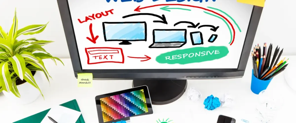
- Responsive Design: Implement responsive design techniques to ensure that your SVG graphics adapt gracefully to different screen sizes and orientations.
- Use SVG Sprites: By combining multiple SVG graphics into a single sprite file, you can reduce HTTP requests, which in turn can enhance page load times.
Incorporating SVG effectively into web design involves a balance between choosing the right method for your specific use case (inline or external SVG) and optimizing SVG files to maintain high performance. These techniques will not only contribute to a visually appealing web design but also ensure that your web pages load quickly and efficiently, benefiting both you and your site’s visitors.
Browser Support and Compatibility
When working with Scalable Vector Graphics (SVG) in web design, it’s crucial to understand how different browsers handle SVG, as well as how to ensure compatibility with older browsers that may not fully support SVG. In this section, we’ll explore these aspects.
SVG Support in Modern Browsers
Modern web browsers have made significant strides in their support for SVG, making it a reliable choice for web designers. Most of the popular browsers, including Google Chrome, Mozilla Firefox, Apple Safari, and Microsoft Edge, provide robust support for SVG. This means that SVG graphics are likely to render as intended in these browsers, maintaining their scalability, quality, and interactivity.
However, while modern browsers generally support SVG well, it’s essential to be aware of the specific SVG features or attributes that may have varying levels of support. Keeping up to date with browser documentation and testing your SVG in different browsers is advisable to ensure a consistent and reliable user experience.
Fallbacks for Older Browsers
While modern browsers handle SVG gracefully, older browsers, particularly Internet Explorer versions 8 and below, may have limited or no native support for SVG. To maintain compatibility with these older browsers, web designers often employ fallback strategies. These fallbacks typically involve providing alternative graphics in a different format, such as PNG or GIF, for browsers that don’t support SVG.
Here are a few common strategies for handling SVG fallbacks:
- Feature Detection: Use feature detection libraries like Modernizr to detect SVG support in the user’s browser. If SVG is not supported, you can load alternative image formats.
- Conditional Comments: For Internet Explorer, you can use conditional comments in your HTML to specify alternative content specifically for older versions of the browser. This content might include PNG or GIF versions of the SVG graphics.
- JavaScript Polyfills: JavaScript libraries or polyfills can be used to add SVG support to older browsers, allowing them to render SVG graphics. However, this approach adds complexity to your code and may impact performance.
- Responsive Images: Incorporate responsive image techniques, such as the <picture> element, to provide different image formats for different screen resolutions and browser capabilities.
While modern browsers generally handle SVG well, it’s crucial to implement fallbacks for older browsers that lack native SVG support. This ensures that your web content remains accessible and visually consistent across a wide range of browsers, catering to both your core audience and those using outdated browser versions.
Best Practices for Using SVG in Web Design
When incorporating Scalable Vector Graphics (SVG) into your web design projects, it’s important to adhere to best practices that ensure optimal performance, responsiveness, and accessibility. In this section, we’ll explore key guidelines for making the most of SVG in your web designs.
Clean and Optimized Code
Keep It Simple: Strive for simplicity in your SVG code. Avoid unnecessary grouping or layers and remove any superfluous elements, comments, or metadata. Clean code is not only more manageable but also results in smaller file sizes.
- Use Proper Naming Conventions: Employ clear and meaningful IDs and class names for SVG elements. This facilitates CSS and JavaScript interactions and improves the maintainability of your code.
- Minimize Grouping: Grouping elements in SVG can be useful for organization, but excessive grouping can lead to bloated code. Keep your SVG structure as flat as possible, using groups only when necessary.
- Optimize for Performance: Use SVG optimization tools or online services to reduce file size and remove redundant code. These tools can help you achieve the right balance between visual quality and file size.
- Incorporate Descriptive Comments: Document your SVG code with descriptive comments to make it more understandable to others and to your future self.
Responsive Design with SVG
- Set ViewBox Attributes: Always define the viewBox attribute in your SVG to specify the coordinate system and aspect ratio. This is crucial for ensuring responsive behavior.
- Use Relative Units: Employ relative units (such as percentages or ems) rather than fixed units (like pixels) for attributes like stroke widths and font sizes. This allows your SVG to scale gracefully with the surrounding content.
- Media Queries: Consider using CSS media queries to adjust the size or appearance of your SVG elements based on the screen width or other conditions.
- Flexibility in Layout: Design your web pages with flexible layouts, such as fluid grids or flexible containers, to accommodate different screen sizes and orientations.
Accessibility Considerations
Provide Descriptive Text: Include meaningful text descriptions for your SVG graphics using the <title> and <desc> elements. This makes your content accessible to users with visual impairments who rely on screen readers.
- Alt Text: When embedding SVG images inline, use the alt attribute to provide a text alternative for non-visual user agents and assistive technologies.
- Focus States: Ensure that interactive SVG elements (e.g., buttons) have clear and visible focus states, so keyboard and screen reader users can navigate and interact with them effectively.
- Color Contrast: Pay attention to color choices and ensure that there is sufficient contrast between text or graphics and their backgrounds to enhance readability and accessibility.
- Test with Assistive Technologies: Regularly test your SVG content with screen readers and other assistive technologies to ensure it is fully accessible.
Incorporating these guidelines will help you create web content that is visually appealing, highly performant, and accessible to a broad audience.
Conclusion
Scalable Vector Graphics (SVG) stand as a fundamental asset in modern web design. Their versatility, scalability, and ability to enhance interactivity make them invaluable tools for creating visually appealing and user-friendly web content. By adhering to best practices, optimizing code, and considering accessibility, designers can leverage the full potential of SVG to deliver exceptional online experiences.
As the web design landscape continues to evolve, SVG remains a cornerstone, promising enduring significance in the ever-changing digital world. Embracing SVG empowers designers to create web content that is not only visually engaging but also highly accessible and responsive across various devices and platforms.
Why Clio Websites
We hope that we helped to understand how to implement SVGs in web design. Our recommendations and techniques are based on years of experience helping businesses like yours.
At Clio, we have helped many clients grow their businesses with websites tuned for engagement and conversions.
Contact us if you would like us to help you create a unique website that your visitor will love.