User Interface (UI) Design is central to the digital world. As technology surges forward, so do the expectations for seamless and engaging digital experiences.
Whether you’re a veteran designer or just beginning your journey into UI design, incorporating key principles is essential.
This article dives into 15 indispensable principles of user interface design that will take your website to the next level:
- Simplicity in UI
- Cohesive UI
- Timely Feedback
- Accessibility in UI Design
- Error Management
- Affordances and Signifiers
- Fitts’s Law in Interactions
- Recognition Over Recall
- User Empowerment
- Structured UI Hierarchy
- White Space and Alignment
- Refined Aesthetics
- Personalized UI Experience
- Mobile-First and Responsive Design
- UI Performance
Let’s unravel these principles to better understand their impact and how they can be effectively applied.
1. Achieving Crystal-Clear Simplicity in UI
The Art of Crafting Intuitive Layouts
Simplicity is key. An intuitive layout feels natural and is easy to understand. Achieve this by organizing information and elements logically, using familiar icons, and avoiding clutter. Users should not feel confused at any point; if they’re not sure what to do next, your design has failed in this aspect.
Evading the Traps of Information Overload
Too much information can overwhelm users. Stick to essential content and employ progressive disclosure to show more information as needed. This concept involves hiding information and actions that aren’t relevant at the moment and providing ways for users to reveal them if necessary. This creates a cleaner, less intimidating interface.
2. Creating a Cohesive, Consistent User Interface
The Power of Uniformity in Design Elements
Consistency in design elements like fonts, colors, and buttons makes the interface predictable and easier to use. It reinforces brand identity and improves user experience. Moreover, consistency in design language and visual elements ensures users can rely on patterns both in aesthetics and functionality.
Building Consistent Navigation Structures
A consistent navigation structure guides users through your application effortlessly. This involves having a clear hierarchy, logical page organization, and consistent placement for navigation elements. Understand the journey you want the users to take and lay down the path for them in a consistent, intuitive way.

3. Offering Timely Feedback and Ultra-Responsiveness
Keeping the User in the Loop
Users should receive immediate feedback on their actions. This can be through loaders, notifications, or simple animations that acknowledge the input. Feedback is communication with your users, and it is crucial in helping them understand the result of an action.
Why Loading Times Are a Cornerstone of UX
Long loading times are a UX killer. Optimize performance to ensure content is delivered swiftly. The quicker the load time, the happier your user will be. Research shows that users can get frustrated and leave if a page takes too long to load. Remember, the competition is just a click away.
4. Making Accessibility a Top Priority in UI Design
Design Considerations for Diverse Abilities
Ensure your design is accessible to all, including those with visual, auditory, or motor disabilities. This involves using semantic HTML for content, ensuring keyboard navigation is possible, and more. Inclusivity is not just ethical, but it broadens your audience. Check out our article on accessibility best practices.
The Legal Landscape of UI Accessibility
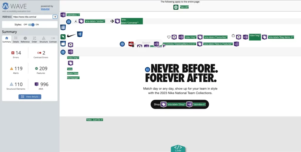
Not only is accessibility morally right, but it’s also a legal requirement in many areas. Adhering to WCAG guidelines is critical. Understanding and meeting these standards can also help in avoiding lawsuits and showing that your organization takes accessibility seriously. In order to test the accessibility of your website, check out the WebAIM audit tool.
5. Averting Errors and Managing the Inevitable
Proactive Design Approaches for Error Prevention
Stop errors before they happen by designing an interface that prevents common mistakes. This could be through disabling certain actions until all requirements are met. For example, you could disable a submit button until all the required fields have been filled and validated.
How to Write Error Messages That Help
Sometimes errors are unavoidable. When they happen, communicate them clearly, without technical jargon, and offer a solution or next step. The language should be friendly and the message should guide the user in resolving the issue, rather than making them feel at fault.
6. Harnessing the Power of Affordances and Signifiers
Make UI Elements Naturally Intuitive
An affordance is a property that shows the actions possible. A button should look like something you can press. Similarly, a slider should invite you to drag it. The more natural and intuitive an action feels the more likely users are to understand how to use your interface with little to no explanation.
Visual Cues as Silent Guides
Signifiers are hints that indicate affordances. For example, underlining text to show it’s clickable, or using shadows on buttons to provide depth, indicating it can be pressed. These subtle cues can guide users through the interface in an almost subconscious way.
7. Applying Fitts’s Law to Streamline Interactions
Decoding Fitts’s Law for UI Designers
Fitts’s Law predicts that the time required to rapidly move to a target area is a function of the ratio between the distance to the target and the width of the target. Use this by making common actions larger or closer to common points of interaction.
Pragmatic Applications in Modern Interfaces
Apply Fitts’s Law by keeping clickable targets large enough to interact with easily and positioning frequently used elements in accessible areas. For instance, this principle is why many mobile apps place navigation at the bottom of the screen, within easy reach.
8. Putting Recognition Over Recall in UI Design
Reducing Cognitive Load for Users
Recognition requires less cognitive effort than recall. Display options, actions, and information openly instead of requiring users to remember them. This is especially important in navigation menus and lists of options.
Visible Elements as Memory Aids
Use icons and text to make functions visible. A user shouldn’t have to remember your icons; they should be clear enough that they don’t need to. Furthermore, combine this with consistency to ensure that once users learn the meaning of an icon or action, they can apply this knowledge throughout the whole experience.
9. Empowering Users Through Control and Freedom
Undo and Redo: Small Features, Big Impact
Mistakes happen. Providing an easy way to undo actions is a relief to users. It empowers them to explore without fear. The option to undo gives users the confidence to explore different functionalities without the fear of making irreversible mistakes.
The Psychology of User Control
When users feel in control, they have a stronger sense of connection with your application. Provide options to change settings, themes, and preferences. User customization lets your audience tailor the experience to their liking, and in turn, they will feel more connected to your product.
10. Building a Structured Hierarchy in Your UI
Logical Organization of UI Elements
A clear hierarchy helps users process information faster. Use size, contrast, and space to show the relationship between elements. Important elements should be larger, bolder, or have greater visual prominence. By establishing a logical hierarchy, users can quickly understand the flow of information and navigate through the interface more efficiently.
Catering to the Human Information Processing System
Humans typically scan screens in an “F” pattern. Keep important elements prominent and closer to the top of the screen. Understand how users visually process information and arrange your content accordingly. Place key elements where users’ eyes naturally gravitate, ensuring important information is not overlooked.
11. The Artful Use of White Space and Alignment
White Space as a Focal Tool
White space is not empty space. It’s a powerful design tool. It can highlight important content and make the layout easy to scan. Strategic use of white space improves readability, allows content to breathe, and directs users’ attention to key elements.
Using Alignment to Create Order
Proper alignment is fundamental in UI design. It creates a visual structure that orders elements on the screen. Aligning elements consistently helps create a sense of order and harmony. Users can quickly understand the relationship between different elements, resulting in a more cohesive and visually pleasing design.
12. Elevating UI Design with Refined Aesthetics
Striking a Balance: Beauty Meets Functionality
Beautiful UI designs are more enjoyable to use. However, don’t let aesthetics hinder functionality. Strive for a balance between the two. A visually appealing interface enhances the user experience, but it should never sacrifice usability. Visual elements should complement the functionality and purpose of the interface.
The Trust-Building Aspect of Aesthetic Design
A polished design can invoke trust. Users are more likely to engage with an application that looks professional and reliable. Consistent branding, visually pleasing aesthetics, and attention to detail contribute to a sense of trustworthiness. A well-designed UI instills confidence and encourages users to engage with your product or service.
13. Personalizing the Experience: Tailoring UI for Users
Customization as a Driver of Engagement
Allow users to make the interface their own. Customization can significantly enhance the user experience. Providing options for customization empowers users and fosters a sense of ownership over the interface. It allows individuals to tailor the experience to their preferences, increasing engagement and satisfaction.
Methods for Personalizing User Interfaces
Provide themes, layout choices, or even customizable shortcuts. Small details can make a user feel at home. Offering options for personalization demonstrates your understanding of diverse user needs and preferences. The ability to adapt the interface to individual preferences enhances user satisfaction and encourages long-term engagement.
14. Embracing Mobile-First and Responsive Design
Adapting to the Mobile Paradigm
Mobile is not the future, it’s the present. Design for small screens first, then scale up. Your design should look good on all devices. Mobile devices are prevalent, and designing with a mobile-first approach ensures that your UI is optimized for the smaller screens of smartphones and tablets.
Design Practices for Cross-Device Compatibility
Responsive design is essential. Use flexible grids and layouts, images, and CSS media queries to ensure your design adjusts to different screen sizes. Cross-device compatibility ensures that your UI provides a consistent and optimal experience across various devices and screen sizes. Users can seamlessly transition between devices without any loss of functionality or visual appeal.
15. Never Underestimate the Power of Performance
The Critical Role of UI Performance
Performance is a design feature. A fast-loading site is more pleasant to use and ranks better in search engine results. Users expect quick and responsive interfaces. Slow-loading pages or laggy interactions can frustrate users and lead to a negative experience. Optimize UI performance to create a smooth and enjoyable user experience.
Winning Strategies for UI Optimization
Optimize images, utilize efficient loading techniques, and regularly monitor your site’s performance. Always look for areas to improve. Performance optimization involves various strategies, such as optimizing images and assets, minimizing HTTP requests, and employing caching mechanisms. Regularly monitoring performance metrics helps identify bottlenecks and areas for improvement, ensuring your UI maintains optimal performance.
Wrapping Up – Principles of User Interface Design
The principles of user interface design, outlined here are your arsenal for creating captivating, functional, and accessible user interfaces. Staying ahead in the evolving world of UI design requires a solid understanding and application of these principles.
The landscape changes rapidly, and new trends emerge. By continuously honing your skills and staying informed, you’ll be well-equipped to navigate the intriguing terrain of UI design.
Remember, designing with the user in mind and implementing these principles will result in remarkable user experiences that stand the test of time.
Why Clio
We hope that you enjoyed reading about the principles of user interface design. Our recommendations and techniques are based on years of experience helping businesses like yours.
At Clio, we have helped many clients grow their businesses with websites tuned for engagement and conversions.
Contact us if you would like us to help you create a unique website that engages visitors and convinces them to hire you or buy your products.