Introduction to Typography in Web Design
In the ever-evolving digital landscape, web design plays a pivotal role in creating captivating online experiences. Among the many elements that contribute to a website’s visual appeal and user-friendliness, typography stands out as a crucial aspect.
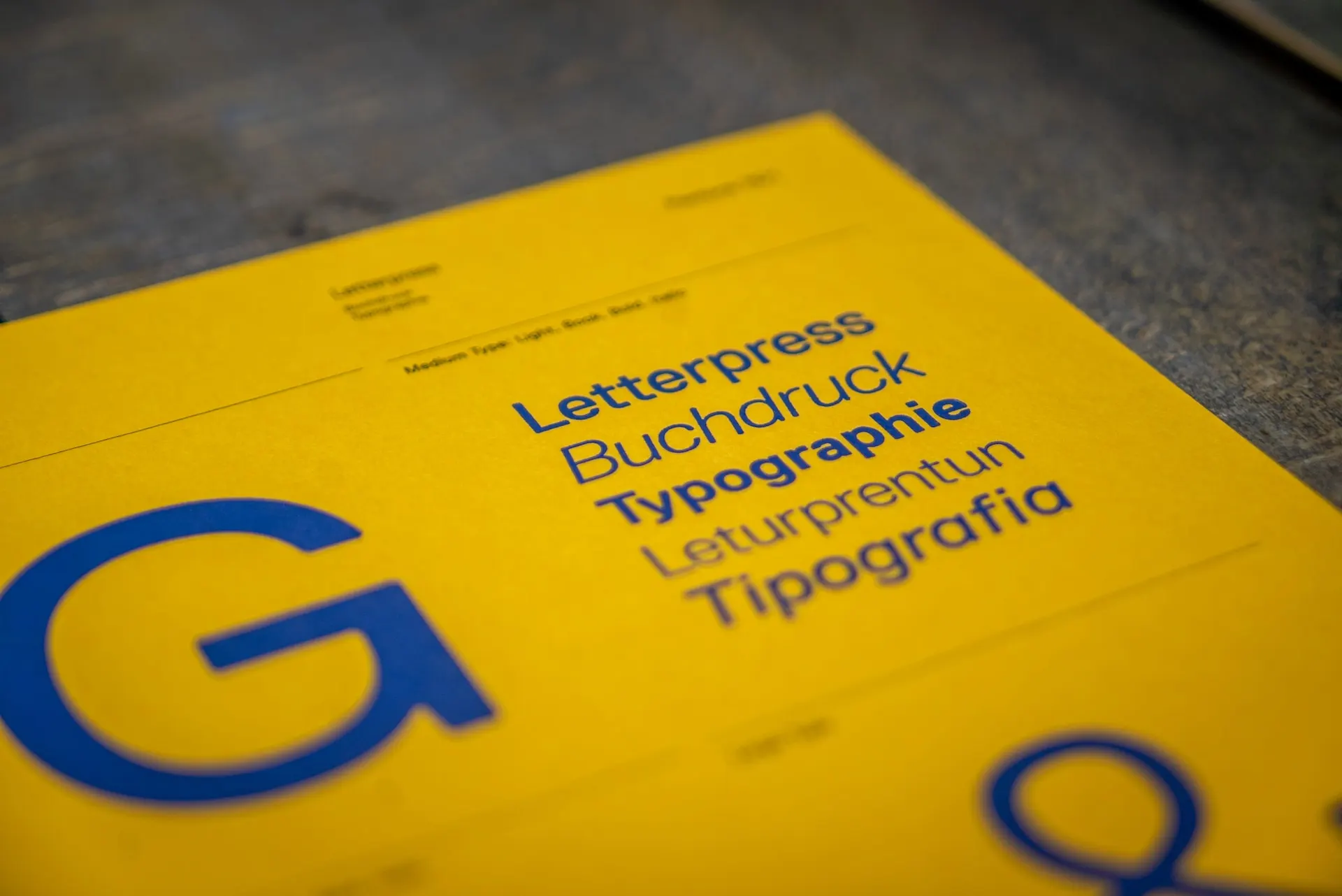
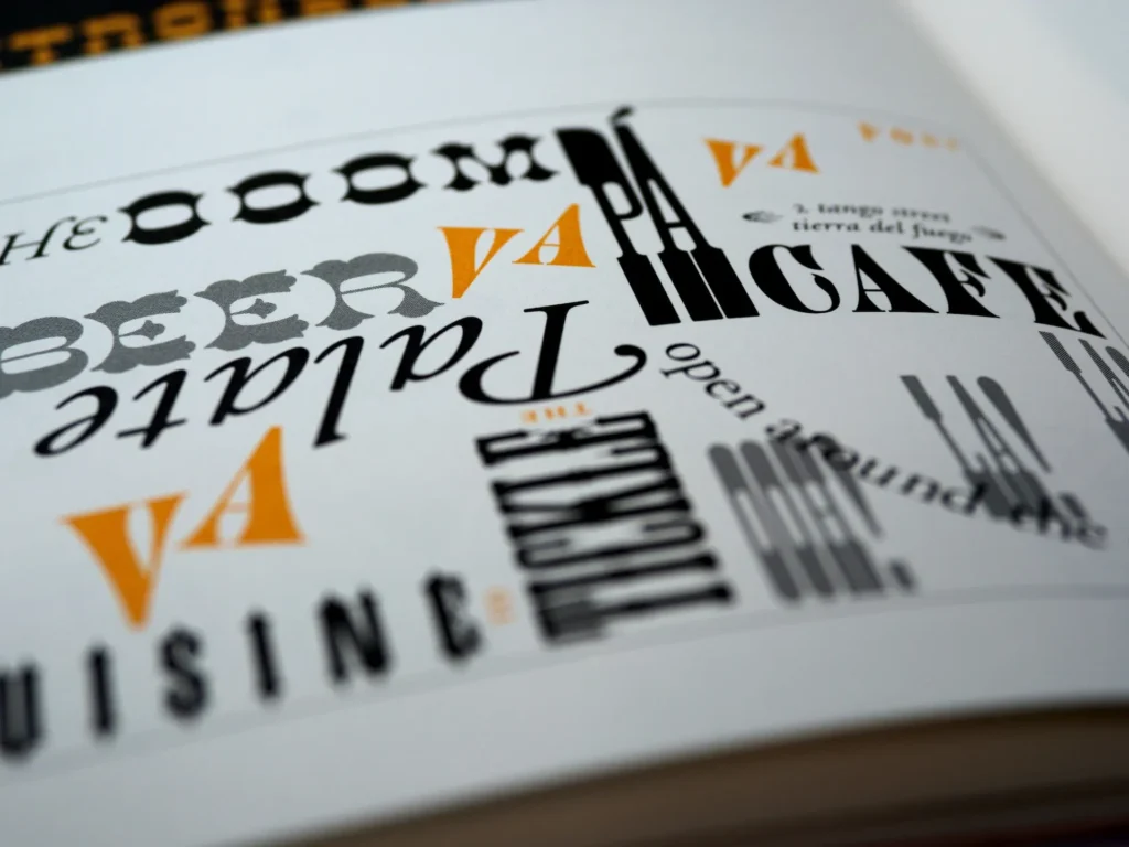
Here is a glaring example of why fonts matter:

Definition and Overview
Typography refers to the art and technique of arranging typefaces to make written language legible, readable, and visually appealing when displayed. It encompasses various elements, such as font styles, sizes, spacing, line lengths, and alignment, which collectively influence how users perceive and interact with written content on the web.
In the context of web design, typography holds immense importance because it directly impacts how visitors engage with a website’s textual information. Effective typography not only enhances the readability and comprehension of content but also conveys the site’s personality and brand identity.
Historical Evolution
The history of typography dates back to ancient civilizations when humans first started recording information in written form. From ancient inscriptions and manuscripts to the invention of movable type by Johannes Gutenberg in the 15th century, typography has continually evolved.
In the realm of web design, the early days saw limited font choices and design possibilities due to technical constraints. Web designers were primarily restricted to using a handful of web-safe fonts to ensure consistency across different devices and platforms. This limitation often resulted in visually monotonous and uninspiring web pages.
However, with technological advancements and the introduction of @font-face and other font embedding techniques, web designers gained the freedom to use a vast array of fonts previously restricted to print media. This breakthrough opened new avenues for creativity, allowing designers to craft unique typographic experiences tailored to their websites’ specific needs.
Moreover, the advent of responsive web design further revolutionized typography on the web. Designers now needed to consider how fonts would adapt to different screen sizes and resolutions, ensuring optimal readability across devices ranging from large desktop monitors to small mobile screens.
As web design practices continued to evolve, the emphasis on typography expanded beyond mere aesthetics. Designers began to recognize the psychological impact of fonts on user experience and started using typography strategically to elicit specific emotions, convey hierarchy, and guide user attention.
The Role of Typography in Web Design
Typography serves as a powerful tool in web design, playing a multifaceted role that goes beyond mere aesthetics.
Communication and User Experience
At its core, web design is about communication. The typography used on a website significantly impacts how effectively that communication takes place. Choosing the right font styles, sizes, and spacing can greatly enhance the readability and comprehension of the content, ensuring that users can absorb information effortlessly.
Clear and legible typography creates a positive user experience by minimizing the cognitive effort required to navigate and understand the website’s content. On the other hand, poorly chosen fonts or excessive use of decorative typefaces can lead to confusion, frustration, and ultimately, a high bounce rate.
In addition to legibility, typography also helps establish the tone and voice of a website. Whether it’s a formal corporate website, a creative portfolio, or an engaging blog, the typefaces used can convey emotions and set the overall mood. By aligning typography with the website’s purpose and target audience, designers can effectively engage users and leave a lasting impression.
Establishing Brand Identity
Typography is a potent tool for brand building and recognition. Consistent use of specific fonts across various brand touchpoints, including the website, logo, marketing materials, and social media, fosters a sense of visual harmony and brand cohesion.
Custom typefaces or uniquely stylized fonts can be particularly impactful in creating a distinctive brand identity. These exclusive fonts help brands stand out in a crowded digital space and reinforce their uniqueness and individuality. When users encounter consistent and well-crafted typography, it instills trust and familiarity, encouraging repeat visits and brand loyalty.
Visual Hierarchy and Readability
An essential aspect of effective web design is guiding users through the content in a logical and intuitive manner. Typography plays a crucial role in establishing visual hierarchy, indicating to users the relative importance of different elements on a page.
Strategic use of font sizes, weights, and styles can draw attention to headlines, subheadings, and key pieces of information. By employing contrast and varying typographic elements, designers can create a clear and easily scannable layout, making it simpler for users to find what they need.
Furthermore, responsive web design requires typography to adapt seamlessly to different screen sizes and resolutions. Ensuring readability across devices, from desktops to mobile phones, is essential for providing a consistent and pleasant user experience.
Key Principles of Typography in Web Design
In the world of web design, mastering the key principles of typography is essential to creating engaging, user-friendly, and visually captivating digital experiences.
Typeface Selection
- Serif vs. Sans-serif
The choice between serif and sans-serif typefaces is one of the fundamental decisions in typography for web design. Serif fonts have small decorative lines or “serifs” at the ends of their characters, while sans-serif fonts lack these embellishments, presenting a cleaner and more modern appearance.
Serif fonts are often associated with tradition, formality, and elegance, making them well-suited for conveying a sense of authority or sophistication. On the other hand, sans-serif fonts exude a more contemporary and approachable feel, making them popular for websites that aim to be modern and user-friendly.
- Display vs. Body Fonts
Web designers must carefully distinguish between display fonts and body fonts. Display fonts are typically more decorative, creative, and attention-grabbing, making them ideal for headlines, banners, or specific design elements that demand emphasis.
Body fonts, on the other hand, are selected for readability and legibility in longer blocks of text. They should be comfortable to read even in smaller sizes and are the primary choice for paragraphs and content-heavy sections of a website.
- Web-safe Fonts and Custom Fonts
Traditionally, web designers were limited to a handful of web-safe fonts to ensure consistent rendering across various devices. However, with the advancement of web technologies, designers can now use custom fonts by utilizing @font-face and other embedding techniques.
Custom fonts allow for greater creative freedom and brand personalization. Still, designers should be cautious to choose custom fonts that maintain good readability and load efficiently to ensure a smooth user experience.
Font Size and Line Spacing
Font size and line spacing significantly influence the readability and user experience of a website. Finding the right balance is essential, as fonts that are too small or too tightly spaced can strain the reader’s eyes, while excessively large fonts and loose line spacing can lead to inefficient use of space and disrupt the flow of the content.
For body text, a font size typically ranging from 16 to 18 pixels is recommended to ensure comfortable reading on various devices. Headings and subheadings can use larger font sizes to establish visual hierarchy and guide users through the content.
Contrast and Color
Contrast in typography involves the differentiation between font color and the background, ensuring that text remains easily discernible. Adequate contrast is vital for accessibility, as users with visual impairments may rely on high contrast for legibility.
Color can also be used strategically to convey information and evoke emotions. However, designers should exercise restraint and avoid using an excessive number of colors or colored text that may impede readability.
Alignment and Justification
The alignment of text plays a role in the overall aesthetics and readability of a website. Left-aligned text is the most common choice for body content as it provides a clean and easy-to-follow structure. Center-aligned text can be effective for certain design elements, but it may be less suitable for long paragraphs.
Justification, or aligning text to both the left and right margins, can create a polished and formal appearance. However, it may also lead to irregular spacing between words, potentially affecting readability, especially in narrow columns or on smaller screens.
Adhering to these key principles of typography in web design ensures that websites present content in a visually appealing, readable, and user-friendly manner. Careful consideration of typeface selection, font size, line spacing, contrast, color, alignment, and justification will contribute to a well-designed and cohesive typographic experience for visitors.
Responsive Typography
In the modern digital landscape, where users access websites on a diverse range of devices, responsive web design has become a paramount consideration. Responsive typography, as a crucial component of this design approach, ensures that the text on a website adapts seamlessly to various screen sizes and resolutions.
Importance of Adaptability
The concept of responsive typography stems from the need to provide an optimal reading experience regardless of the device used. Whether visitors access a website on a large desktop monitor, a tablet, or a smartphone, the text must remain readable, legible, and aesthetically pleasing.
Failing to address responsive typography can result in content that is either too small to read on smaller screens or disproportionately large on larger displays, leading to a subpar user experience and potential user disengagement.
Media Queries for Typography
Media queries are a cornerstone of responsive web design, enabling designers to adapt characteristics of the user’s device. When it comes to responsive typography, media queries play a vital role in defining how fonts should adjust and scale across different screen sizes.
Designers can utilize media queries to set specific font sizes, line heights, and even switch between different typefaces to accommodate various devices. For instance, they may define larger font sizes and increased line spacing for mobile devices to enhance readability on smaller screens. With media queries, the typography can be fine-tuned to ensure that the text remains legible and visually pleasing, regardless of the screen dimensions.
Fluid Typography Techniques
Fluid typography refers to the practice of creating flexible font sizes based on the viewport size rather than fixed pixel values. This approach allows text to scale smoothly as users resize their browser window or switch between devices with different screen sizes.
One popular technique for implementing fluid typography is using relative units like “em” and “rem” instead of fixed pixel values. “Em” units are relative to the font size of the parent element, while “rem” units are relative to the root element, making them particularly useful for creating consistent typography across the entire website.
CSS viewport units, such as “vw” (viewport width) and “vh” (viewport height), can also be employed to create fluid typography. For example, setting the font size to “3vw” means that the font will be 3% of the viewport width, adjusting proportionally as the user resizes the window.
Combining media queries with fluid typography techniques allows web designers to craft responsive and adaptive typography that ensures an optimal reading experience across all devices. By striking the right balance between font size, line spacing, and typeface choices, designers can create a harmonious and engaging user experience that leaves a positive impression on visitors.
Best Practices for Typography in Web Design
Effective typography can significantly enhance the overall user experience of a website. To make the most of this crucial design element, web designers should adhere to certain best practices.
Impact on Diverse User Groups
In the realm of web design, prioritizing accessibility and inclusivity is of paramount importance. Typography plays a crucial role in making websites more user-friendly for individuals with diverse abilities and needs. It directly impacts users with visual impairments, cognitive differences, and those accessing the web on various devices.
For users with visual impairments, including those with low vision or color blindness, choosing appropriate font sizes, contrast ratios, and color combinations is vital. Additionally, users with dyslexia and cognitive differences benefit from clear and straightforward typography that enhances readability and comprehension.
Ensuring Readability for All Users
To ensure typography is accessible to all users, designers should focus on elements that enhance readability. Selecting legible fonts, providing ample spacing between lines and characters, and avoiding excessive use of decorative fonts are essential steps to support users with various visual abilities.
Proper contrast between the text and background is critical. Designers should avoid light gray text on white backgrounds or dark text on dark backgrounds, as these combinations can be challenging to read, especially for users with low vision or contrast sensitivity.
Accessibility Guidelines and Best Practices
Web designers should adhere to established accessibility guidelines to create typography that accommodates diverse user groups. Key standards to consider include:
- Web Content Accessibility Guidelines (WCAG): Developed by the Web Accessibility Initiative (WAI) of the World Wide Web Consortium (W3C), WCAG provides comprehensive guidance on creating accessible web content. It covers typography-related aspects such as contrast ratios, font size, and keyboard navigation.
- Using Semantic HTML: Employing proper HTML tags, such as <h1> for headings and <p> for paragraphs, ensures that screen readers and other assistive technologies can interpret the content accurately.
- ARIA (Accessible Rich Internet Applications) Roles: Implementing ARIA roles and attributes aids in conveying the document structure and interactive elements to assistive technologies.
- Responsive Design: Ensuring responsive typography, as discussed in Section IV, is vital for accessibility, as it enables content to adapt to various screen sizes and orientations.
- Testing with Assistive Technologies: Testing typography with screen readers, speech recognition software, and other assistive tools helps identify and address accessibility issues effectively.
By following these guidelines and best practices, web designers can create typography that is accessible and inclusive, fostering a positive user experience for all visitors, regardless of their abilities or devices. Embracing accessibility in typography not only aligns with ethical design principles but also expands the potential audience and impact of the website.
Typography and User Engagement
Typography plays a pivotal role in driving user engagement on websites and applications, with its ability to evoke emotions and establish a strong connection with visitors.
Emotional Connection and User Perception
Typography has the power to evoke emotions and establish a connection with website visitors. The choice of fonts, their styles, and the overall typographic design can influence how users perceive the brand, content, and message conveyed on the website.
Certain typefaces may exude a sense of warmth and friendliness, while others may project professionalism and authority. By aligning the typography with the website’s purpose and target audience, designers can create an emotional resonance that resonates with users, fostering a positive perception of the brand or content.
Moreover, typographic elements, such as letter shapes, line thickness, and letter spacing, can subconsciously communicate specific qualities about the content. For example, rounded and flowing fonts may convey a sense of playfulness, whereas sharp and angular typefaces can evoke a feeling of boldness or edginess. By using typography intentionally, designers can reinforce the website’s intended message and enhance the overall user experience.
Call to Action and Conversions
In web design, a call to action (CTA) is a crucial element that prompts users to take specific actions, such as signing up for a newsletter, making a purchase, or contacting the company. Typography plays a pivotal role in making CTAs stand out and compelling users to act.
Designers can use typographic techniques, such as larger font sizes, contrasting colors, or bold styling, to draw attention to CTAs and make them more prominent on the page. Creating a sense of urgency with typography, like using action-oriented language and dynamic fonts, can further encourage users to take immediate action.
Moreover, the readability and clarity of CTAs are vital for conversions. If users find it challenging to read the CTA due to poor font choices, size, or color contrast, they may be less inclined to engage with the call to action.
By understanding the psychological impact of typography and employing it effectively in call to actions, web designers can significantly improve user engagement and boost conversion rates.
Typography plays a pivotal role in user engagement on websites. By forging an emotional connection with users through thoughtful typographic choices and optimizing call to actions, designers can create compelling and persuasive web experiences that captivate visitors and drive them to interact with the content, ultimately leading to a more successful and user-friendly website.
Typography in Branding and Marketing
Typography serves as a powerful tool in branding and marketing, enabling businesses to create a distinctive and memorable brand image while reinforcing their brand personality through carefully chosen fonts and typographic elements.
Creating a Memorable Brand Image
Typography plays a central role in building a distinctive and memorable brand image. Brands often use custom or unique typefaces that are carefully crafted to align with their core values and personality. These exclusive fonts set the brand apart from competitors and contribute to its visual identity.
When choosing typography for branding, designers consider factors such as legibility, scalability, and versatility. The selected typefaces must be easily recognizable and work well across various marketing materials, from logos and website headers to packaging and promotional materials.
Additionally, consistent use of typography across all touchpoints reinforces brand recognition, ensuring that customers can identify the brand instantly, thereby bolstering brand loyalty and recall.
Reinforcing Brand Personality
Typography is a potent tool for expressing brand personality and evoking specific emotions. Different fonts have distinct visual characteristics that can project various traits, such as modernity, sophistication, playfulness, or reliability. Designers carefully select typefaces that resonate with the brand’s intended personality and messaging.
For instance, a luxury brand may opt for elegant and refined serif fonts to communicate exclusivity and prestige, while a tech startup may choose sleek and modern sans-serif fonts to convey innovation and cutting-edge appeal.
Beyond the choice of typefaces, designers use other typographic elements like letter spacing, line heights, and font weights to reinforce the desired brand personality. Consistency in typographic style across marketing materials and campaigns further solidifies the brand’s identity in the minds of consumers.
Trends and Innovations in Web Typography
As web design continues to evolve, exploring the latest trends and innovations in web typography opens up exciting possibilities for creating dynamic, immersive, and visually captivating digital experiences.
Variable Fonts
Variable fonts continue to be at the forefront of web typography trends, revolutionizing the way typefaces are used on the web. Unlike traditional fonts that are defined by fixed styles (e.g., regular, bold, italic), variable fonts contain multiple axes of variation, allowing for dynamic adjustments in weight, width, slant, and more.
This innovation enables designers to create more adaptable and responsive typographic designs, as a single variable font can produce a range of styles, eliminating the need to load multiple font files. This not only improves web page performance but also grants designers greater flexibility in customizing typography to suit different screen sizes, resolutions, and user preferences.
Variable fonts empower designers to experiment with more unique and dynamic typographic experiences, enhancing creativity and user engagement. As browsers continue to support variable fonts, they are set to become a standard feature in web design, opening up exciting possibilities for typography on the web.
Animation and Interactive Typography
The use of animation and interactive elements in typography has emerged as a captivating trend in web design. Animating individual letters, words, or entire sentences can bring typography to life, creating visually engaging and memorable user experiences.
Animated typography can serve various purposes, from drawing attention to specific content to conveying emotions or narratives in a more dynamic way. Designers can experiment with various animation techniques, such as fades, transitions, rotations, and scaling, to add flair and interactivity to the text.
Furthermore, interactive typography goes beyond animation and enables users to engage directly with the text. For instance, designers may incorporate interactive hover effects or click interactions, allowing users to reveal hidden text, trigger pop-ups, or unveil additional information.
By leveraging animation and interactive features, web designers can craft immersive and interactive typographic experiences that capture users’ attention and make the content more memorable.
Typography and User Interface (UI) Design
In the realm of user interface (UI) design, typography plays a pivotal role in shaping the visual and interactive aspects of websites and applications, providing a seamless and engaging user experience.
Typography in UI Elements
Typography plays a vital role in shaping the overall user interface (UI) design of websites and applications. UI elements, such as buttons, menus, form fields, and alerts, heavily rely on typography to communicate information and guide user interactions.
Clear and legible typography is essential in UI design to ensure users can easily understand the purpose and functionality of each element. Consistency in font choices, sizes, and styles across UI components fosters a coherent and intuitive user experience, reducing the cognitive load for users.
Designers must carefully consider the hierarchy of typography in UI elements, using different font weights, sizes, and colors to signify importance and visual prominence. Headings and labels should stand out from body text, guiding users through the interface and directing their attention to crucial information.
Consistency and UI Patterns
Consistency in typography is crucial in UI design to establish familiarity and reinforce UI patterns. UI patterns are established conventions and design solutions for common interactions, such as navigation bars, search boxes, and buttons.
By adhering to consistent typography within these patterns, designers create a sense of unity and ease of use for users across the application or website. Familiar typography also enhances user trust and confidence in the interface, as it allows them to predict how elements will behave and where they can find essential information.
Consistency in typography extends beyond font choices and includes factors like line spacing, alignment, and use of white space. When UI elements follow a consistent typographic style, users can focus on the content and tasks at hand without distractions or confusion.
Adhering to established UI patterns while incorporating thoughtful typography results in a seamless and user-friendly experience, ultimately driving user engagement and satisfaction.
Best Practices for Implementing Typography in Web Design
Implementing typography effectively in web design requires adherence to best practices that encompass collaboration between designers and developers, as well as a continuous process of testing and iteration, ensuring a user-friendly and visually appealing typographic experience.
Collaborating with Designers and Developers
- Early Involvement: Effective typography in web design requires seamless collaboration between designers and developers from the project’s outset. Designers should work closely with developers to understand the technical constraints and possibilities of implementing various typographic elements.
- Design Systems: Establishing a design system that includes typographic guidelines is essential for consistency and efficiency. A well-defined design system ensures that typography is applied consistently across the entire website or application, reducing the risk of discrepancies during development.
- Accessibility Considerations: Collaboration should prioritize accessibility and inclusivity. Designers and developers must collaborate to implement typography that meets accessibility guidelines, ensuring that all users, including those with disabilities, can interact with the content effortlessly.
- Responsive Typography: Collaboration becomes even more critical when addressing responsive typography. Designers and developers should collaborate to create fluid typography that adapts smoothly to different screen sizes and resolutions, optimizing the user experience on all devices.
Testing and Iteration
- User Testing: Conducting user testing on typography is essential to gather feedback and identify potential usability issues. User feedback can reveal how users interact with the typography and whether any adjustments are needed to improve readability and engagement.
- A/B Testing: A/B testing involves comparing two variations of a design to determine which performs better. Designers can use A/B testing to compare different typographic elements, such as font styles, sizes, or colors, to assess their impact on user behavior and preferences.
- Iterative Design Process: Typography, like other design elements, benefits from an iterative design process. Designers should continuously refine and improve the typography based on user feedback and testing results. Regularly reassessing typography during the design and development stages ensures that it aligns with user needs and project goals.
- Performance Optimization: Collaboration between designers and developers is crucial for optimizing typography’s performance. Reducing the file size of custom fonts, implementing font preloading, and optimizing font loading strategies help improve website loading times, enhancing the user experience.
By following these best practices and fostering a collaborative approach, web designers can implement typography that enhances the overall user experience and aligns with the project’s objectives.
Regular testing and iteration enable designers to make informed decisions, ensuring that typography remains a strong and impactful design element throughout the web design process.
Conclusion
Importance of Typography in Web Design
The significance of typography in web design cannot be emphasized enough. As a potent visual and communicative tool, typography greatly influences user engagement, brand perception, and the overall user experience on websites and applications.
From establishing an emotional connection with users through thoughtfully chosen typefaces to directing their attention with effective visual hierarchy, typography plays a pivotal role in shaping how visitors interact with digital content.
By adhering to best practices for typography selection, readability, and accessibility, web designers can create websites that are inclusive, user-friendly, and aesthetically pleasing. Typography also assumes a critical role in branding and marketing, contributing to the creation of a memorable brand image and reinforcing the brand’s personality.
Future Outlook and Continuous Evolution
The future of typography in web design holds exciting potential, driven by ongoing technological advancements and creative innovations. Trends like variable fonts and animation are revolutionizing how typography is used, granting designers greater flexibility and interactivity in their typographic designs.
As web technologies continue to evolve, responsive typography will remain a vital consideration, ensuring optimal reading experiences on various devices and screen sizes.
Furthermore, the pursuit of accessibility and inclusivity in typography will continue to shape web design practices, making digital content more reachable to users with diverse abilities and needs.
The constant evolution of typography in web design requires a commitment to learning and staying up-to-date with emerging trends and best practices. Web designers must embrace a growth mindset, engaging in continuous learning and experimentation to push the boundaries of what is achievable with typography.
In summary, typography in web design is an ever-evolving field that plays a central role in creating engaging, accessible, and visually captivating digital experiences.
By understanding the importance of typography and embracing the future of web design, designers can continually enhance their craft and contribute to the advancement of user-centric and impactful web design practices.
As technology progresses and creative boundaries expand, typography will remain an integral aspect of the dynamic and ever-changing landscape of web design.
Why Clio
We hope that we helped to understand the role of typography in web design. Our recommendations and techniques are based on years of experience helping businesses like yours.
At Clio, we have helped many clients grow their businesses with websites tuned for engagement and conversions.
Contact us if you would like us to help you create a unique website that your visitor will love.